This post may contain affiliate links. Thank you for your support.
There are certain colors and finishes around our house that I get asked about all the time, so I thought today it might be helpful to round up some of the most requested finishes all into one post. Here are our traditional farmhouse paint colors and finishes from all areas of our home.
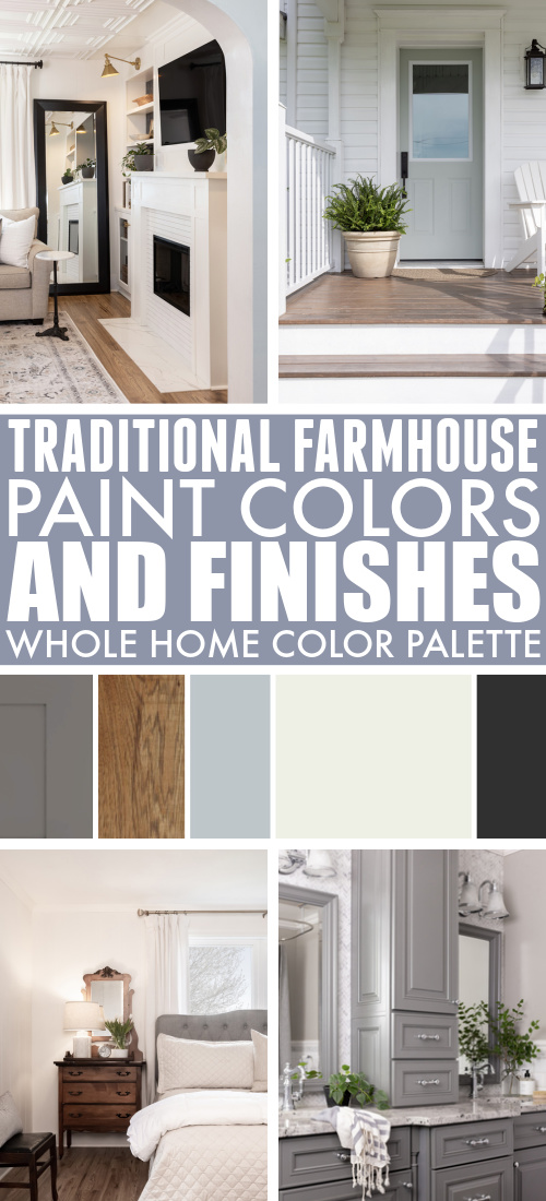
I just love it when I get an email from a reader asking me about a certain paint color or finish from our home. It just makes me feel like I must have made the right choice, especially when it’s something that we installed years ago. Picking colors and finishes for your home can be a daunting task and we all worry about making choices that we might quickly get tired of, or that might “go out of style”, but when someone is still asking me about it seven years later, I know I’ve made a solid, classic choice. I wanted to share some examples of finishes that I get asked about a lot today to maybe give you a bit of inspiration and reassurance about the choices that you make when you do upgrades around your home. Our home is a circa 1900 farmhouse in Southwestern Ontario and I typically gravitate towards classic, traditional style decor so I try to make my choices suit our home’s style as much as possible. Here are our traditional farmhouse paint colors and finishes.
Bathroom and Mudroom Cabinetry
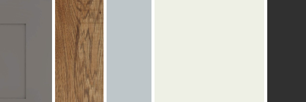
We worked with Kraftmaid to do the cabinetry in both these rooms. We did the ensuite bathroom first and loved the color so much that we used it again with a bit of a simpler style of cabinetry and a different hardware choice in the mudroom. I get asked about this color constantly. The dark grey is actually one of the proprietary Kraftmaid colors called Greyloft and I would highly recommend it. Grey was really popular in home decor a few years ago and of course now it’s on its way out and can sometimes look a bit outdated, but this particular color of grey tends to lean more towards a classic, timeless Nantucket grey than the overused greys of 2015.
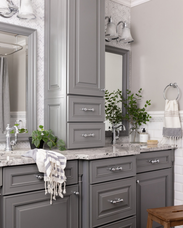
Pictured above: Faucets | Hand towel | Towel ring | Drawer pulls | Knobs
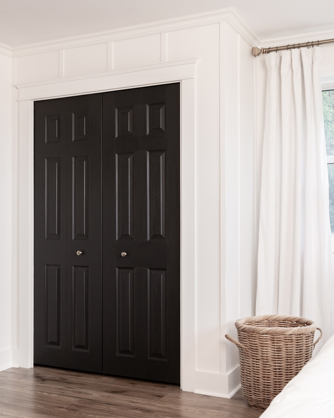
Bedroom Wall and Door Paint Colors
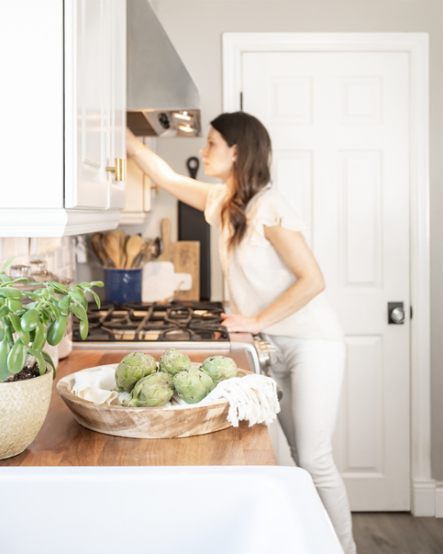
I painted our bedroom Benjamin Moore White Dove last fall and I still just can’t get over how much I love it. It’s the perfect warmish white with a bit of depth to it and I used it in eggshell on the walls and in the satin finish on all the trim. It just feels calm and clean and like all is well in the world. 🙂 After seeing a photo of a kitchen full of White Dove cabinetry with an island in Benjamin Moore Onyx, I knew that was the color I wanted for our closet door. I also painted the French door between the kitchen and the mudroom the same color and I’m currently looking for other places for it. I love the contrast it brings to the spaces I use it in and the fact that it feels very traditional paired with the White Dove and not too “modern farmhouse” like we’ve been seeing everywhere for the past few years.
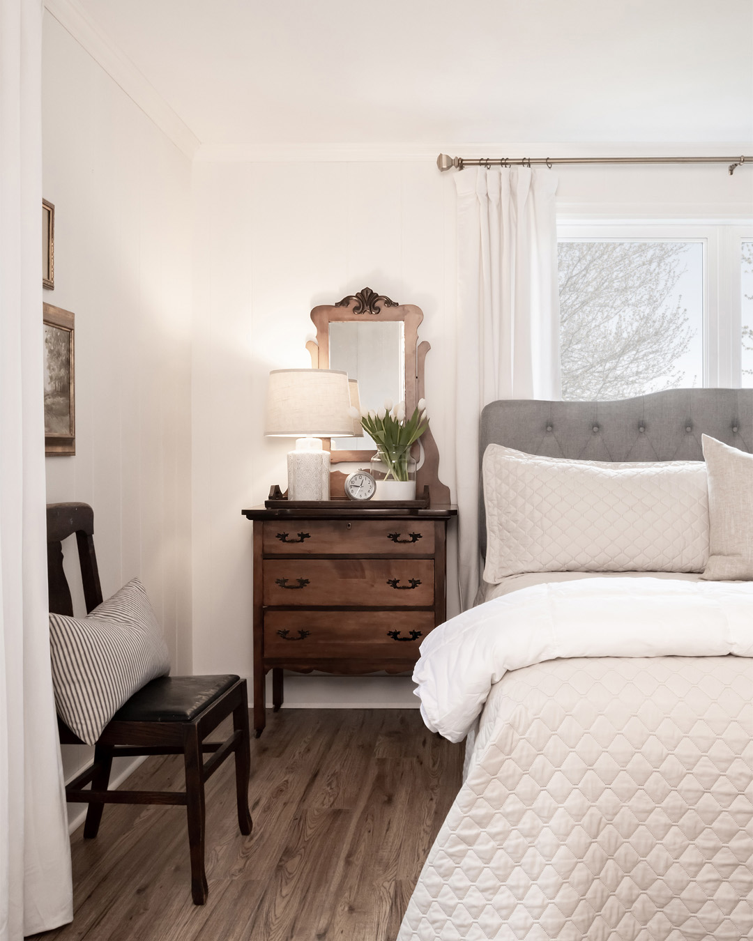
Pictured above: Curtains | Headboard | Vase
Laminate Flooring
This is the flooring pictured above in our primary bedroom, as well as the middle part our house containing the living room, dining room, and front hall. We did not intend to keep this inexpensive laminate flooring in place for long and it was supposed to be kind of a temporary fix, but it has actually turned out to be perfect and we really have no intention of replacing it any time soon now. This is the Home Decorator’s Collection Laminate from Home Depot in the color called “Truswell Hickory”. It actually remained in stock for quite a few years after we installed it, but it looks like it’s been phased out now. This flooring has proven to be so durable and scratch proof after five years of kids and pets and we couldn’t be happier with the medium/light color. After a quick look at the Home Depot website, I see that they carry a few really nice similar options now that I would use if I was going for this same look. This Calistoga Oak is beautiful as well as this Ghost Ship Maple. I definitely recommend this flooring if you’re looking for a budget friendly option!
Butcher Block Kitchen Counters
I can’t believe the number of people that ask us about our counters still to this day, after seven-ish years of having them installed. People often would like to know what type of wood they are as well as what color stained we used to finish them and what type of top coat we used. The answer couldn’t be simpler: IKEA. Their butcher block comes pre-finished and it has held up amazingly well over the years to wear and tear as well as water sitting on them daily. We assumed we’d be doing some refinishing at some point, but we still haven’t needed to. These are the “Karlby” counters and they’ve just been the perfect choice for us.
You can read more about how I maintain them in this post here: The Secret to Keeping Wood Counters Beautiful
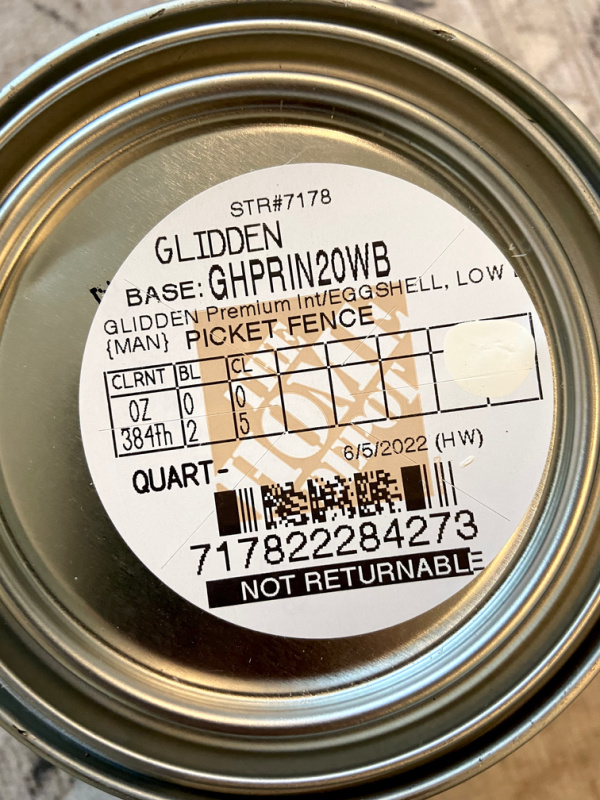
White Paint – Martha Stewart “Picket Fence”
This is funny one. I chose this color to be the color for our trim and any walls we painted white 11 years ago when we moved in and when Martha Stewart still had a paint line. The paint was discontinued a few years later, but I just kept having the paint counter at Home Depot remix new cans for me using the code from the old paint can lids time after time. It just made sense for continuity and also just because it’s a really great white. It’s a bit warm and not too far off from White Dove, actually, but just a little more of a crisp white. I’ve paired it with grey and navy and beige and mid-blue over the years and it has always looked just right so I just keep coming back to it, even though it’s kind of a paint for the workers at the paint counter now. 🙂 All the walls and trim including the fireplace in our living room are painted this color. If you’d like to be a pain to your local paint desk too, here’s what the code looks like on the top of the paint can.
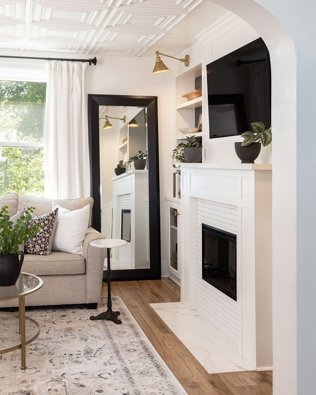
Pictured above: Rug | Coffee table | Similar side table (that I also own) | Bookshelf lights | Curtains | Block print pillow
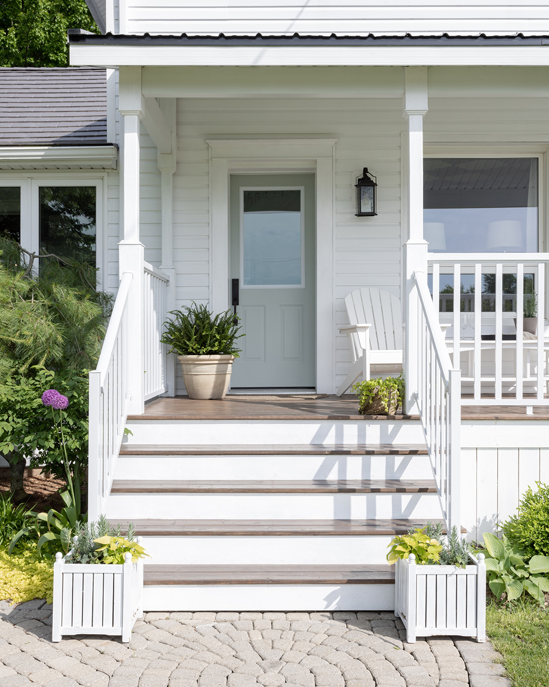
Front Door Color – Behr Keystone Gray
I don’t even remember how I chose this color, but I’m so glad I did. It’s just the softest, most greyed-down blue you’ve ever seen. I’m definitely guilty of getting tired of colors that are too saturated, and I just never seem to tire of this one. It gives the front of our house a bit of personality with all the black and white we have going on, without ever being too loud. It somehow manages to look equally soft on the inside and the outside of the door despite the different light conditions, which is pretty impressive.
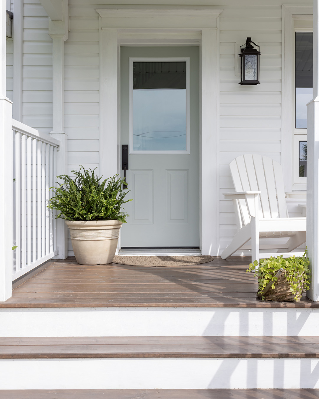
Pictured above: Door hardware | All-weather Adirondack chairs | Indestructible doormat
Porch Paint and Stain
We actually don’t have many painted surfaces on our porch. The railings are all powder-coated aluminum, the siding is vinyl, and Chris wrapped the beams around the top of our porch in metal as well to help them stand up to the elements. The posts and the trim around the door are painted though, as well as the skirting around the bottom of the porch and it’s all done in straight-outta-the-can white in the Behr Marquee outdoor line. The color is just perfect and we love how well this paint stands up to the elements. It’s pretty amazing stuff, actually, and well worth the higher price point from our experience. The stain on the decking is Behr semi-transparent stain in Cordovan Brown. I’m really happy with the non-orangeyness of this color and how it plays nicely with everything else around it.
Did I miss anything? If you have any questions about any colors, finishes, or pieces that you’ve seen around our home, just ask! 🙂
MORE IDEAS LIKE THIS
- How to Make a Cheap Pillow Look Expensive
- How to Wash a Ruggable
- My Top Wayfair Picks
- 10 Thrift Store Home Decor Finds You Should Never Leave Behind
- Small Design Details in Our Bedroom That Make a Big Difference
- The Creek Line House Home Decor Archives
This post contains affiliate links.

Courtenay Hartford is the author of creeklinehouse.com, a blog based on her adventures renovating a 120-year-old farmhouse in rural Ontario, Canada. On her blog, Courtenay shares interior design tips based on her own farmhouse and her work as founder and stylist of the interior photography firm Art & Spaces. She also writes about her farmhouse garden, plant-based recipes, family travel, and homekeeping best practices. Courtenay is the author of the book The Cleaning Ninja and has been featured in numerous magazines including Country Sampler Farmhouse Style, Better Homes and Gardens, Parents Magazine, Real Simple, and Our Homes.
- Courtenay Hartford
- Courtenay Hartford
- Courtenay Hartford
- Courtenay Hartford
- Courtenay Hartford
- Courtenay Hartford
- Courtenay Hartford
- Courtenay Hartford
- Courtenay Hartford
- Courtenay Hartford
- Courtenay Hartford
- Courtenay Hartford
- Courtenay Hartford
- Courtenay Hartford
- Courtenay Hartford
- Courtenay Hartford
- Courtenay Hartford
- Courtenay Hartford
- Courtenay Hartford
- Courtenay Hartford
- Courtenay Hartford
- Courtenay Hartford
- Courtenay Hartford
- Courtenay Hartford
- Courtenay Hartford
- Courtenay Hartford
- Courtenay Hartford
- Courtenay Hartford
- Courtenay Hartford
- Courtenay Hartford
- Courtenay Hartford
- Courtenay Hartford
- Courtenay Hartford
- Courtenay Hartford
- Courtenay Hartford
- Courtenay Hartford
- Courtenay Hartford
- Courtenay Hartford
- Courtenay Hartford
- Courtenay Hartford
- Courtenay Hartford
- Courtenay Hartford
- Courtenay Hartford
- Courtenay Hartford
- Courtenay Hartford
- Courtenay Hartford
- Courtenay Hartford
- Courtenay Hartford
- Courtenay Hartford
- Courtenay Hartford
- Courtenay Hartford
- Courtenay Hartford
- Courtenay Hartford
- Courtenay Hartford
- Courtenay Hartford
- Courtenay Hartford
- Courtenay Hartford
- Courtenay Hartford
- Courtenay Hartford
- Courtenay Hartford
- Courtenay Hartford
- Courtenay Hartford
- Courtenay Hartford
- Courtenay Hartford
- Courtenay Hartford
- Courtenay Hartford
- Courtenay Hartford
- Courtenay Hartford
- Courtenay Hartford
- Courtenay Hartford
- Courtenay Hartford
- Courtenay Hartford
- Courtenay Hartford
- Courtenay Hartford
- Courtenay Hartford
- Courtenay Hartford
- Courtenay Hartford
- Courtenay Hartford
- Courtenay Hartford
- Courtenay Hartford
- Courtenay Hartford
- Courtenay Hartford
- Courtenay Hartford
- Courtenay Hartford
- Courtenay Hartford
- Courtenay Hartford
- Courtenay Hartford
- Courtenay Hartford
- Courtenay Hartford
- Courtenay Hartford
- Courtenay Hartford
- Courtenay Hartford
- Courtenay Hartford
- Courtenay Hartford
- Courtenay Hartford
- Courtenay Hartford
- Courtenay Hartford
- Courtenay Hartford
- Courtenay Hartford
- Courtenay Hartford
- Courtenay Hartford
- Courtenay Hartford
- Courtenay Hartford
- Courtenay Hartford
- Courtenay Hartford
- Courtenay Hartford
- Courtenay Hartford
- Courtenay Hartford
- Courtenay Hartford
- Courtenay Hartford
- Courtenay Hartford
- Courtenay Hartford
- Courtenay Hartford
- Courtenay Hartford
- Courtenay Hartford
- Courtenay Hartford
- Courtenay Hartford
- Courtenay Hartford
- Courtenay Hartford
- Courtenay Hartford
- Courtenay Hartford
- Courtenay Hartford
- Courtenay Hartford
- Courtenay Hartford
- Courtenay Hartford
- Courtenay Hartford
- Courtenay Hartford
- Courtenay Hartford
- Courtenay Hartford
- Courtenay Hartford
- Courtenay Hartford
- Courtenay Hartford
- Courtenay Hartford
- Courtenay Hartford
- Courtenay Hartford
- Courtenay Hartford
- Courtenay Hartford
- Courtenay Hartford
- Courtenay Hartford
- Courtenay Hartford
- Courtenay Hartford
- Courtenay Hartford
- Courtenay Hartford
- Courtenay Hartford
- Courtenay Hartford
- Courtenay Hartford
- Courtenay Hartford
- Courtenay Hartford
- Courtenay Hartford
- Courtenay Hartford
- Courtenay Hartford
- Courtenay Hartford
- Courtenay Hartford
- Courtenay Hartford
- Courtenay Hartford
- Courtenay Hartford
- Courtenay Hartford
- Courtenay Hartford
- Courtenay Hartford
- Courtenay Hartford
- Courtenay Hartford
- Courtenay Hartford
- Courtenay Hartford
- Courtenay Hartford
- Courtenay Hartford
- Courtenay Hartford
- Courtenay Hartford
- Courtenay Hartford
- Courtenay Hartford
- Courtenay Hartford
- Courtenay Hartford
- Courtenay Hartford
- Courtenay Hartford
- Courtenay Hartford
- Courtenay Hartford
- Courtenay Hartford
- Courtenay Hartford
- Courtenay Hartford
- Courtenay Hartford
- Courtenay Hartford
- Courtenay Hartford
- Courtenay Hartford
- Courtenay Hartford
- Courtenay Hartford
- Courtenay Hartford
- Courtenay Hartford
- Courtenay Hartford
- Courtenay Hartford
- Courtenay Hartford
- Courtenay Hartford
- Courtenay Hartford
- Courtenay Hartford
- Courtenay Hartford
- Courtenay Hartford
- Courtenay Hartford
- Courtenay Hartford
- Courtenay Hartford
- Courtenay Hartford
- Courtenay Hartford
- Courtenay Hartford
- Courtenay Hartford
- Courtenay Hartford
- Courtenay Hartford
- Courtenay Hartford
- Courtenay Hartford
- Courtenay Hartford
- Courtenay Hartford
- Courtenay Hartford
- Courtenay Hartford
- Courtenay Hartford
- Courtenay Hartford
- Courtenay Hartford
- Courtenay Hartford
- Courtenay Hartford
- Courtenay Hartford
- Courtenay Hartford
- Courtenay Hartford
- Courtenay Hartford
- Courtenay Hartford
- Courtenay Hartford
- Courtenay Hartford
- Courtenay Hartford
- Courtenay Hartford
- Courtenay Hartford
- Courtenay Hartford
- Courtenay Hartford
- Courtenay Hartford
- Courtenay Hartford
- Courtenay Hartford
- Courtenay Hartford
- Courtenay Hartford
- Courtenay Hartford
- Courtenay Hartford
- Courtenay Hartford
- Courtenay Hartford
- Courtenay Hartford
- Courtenay Hartford
- Courtenay Hartford
- Courtenay Hartford
- Courtenay Hartford
- Courtenay Hartford
- Courtenay Hartford
- Courtenay Hartford
- Courtenay Hartford
- Courtenay Hartford
- Courtenay Hartford
- Courtenay Hartford
- Courtenay Hartford
- Courtenay Hartford
- Courtenay Hartford
- Courtenay Hartford
- Courtenay Hartford
- Courtenay Hartford
- Courtenay Hartford
- Courtenay Hartford
- Courtenay Hartford
- Courtenay Hartford
- Courtenay Hartford
- Courtenay Hartford
- Courtenay Hartford
- Courtenay Hartford
- Courtenay Hartford
- Courtenay Hartford
- Courtenay Hartford
- Courtenay Hartford
- Courtenay Hartford
- Courtenay Hartford
- Courtenay Hartford
- Courtenay Hartford
- Courtenay Hartford
- Courtenay Hartford
- Courtenay Hartford
- Courtenay Hartford
- Courtenay Hartford
- Courtenay Hartford
- Courtenay Hartford
- Courtenay Hartford
- Courtenay Hartford
- Courtenay Hartford
- Courtenay Hartford
- Courtenay Hartford
- Courtenay Hartford
- Courtenay Hartford
- Courtenay Hartford
- Courtenay Hartford
- Courtenay Hartford
- Courtenay Hartford
- Courtenay Hartford
- Courtenay Hartford
- Courtenay Hartford
- Courtenay Hartford
- Courtenay Hartford
- Courtenay Hartford
- Courtenay Hartford
- Courtenay Hartford
- Courtenay Hartford
- Courtenay Hartford
- Courtenay Hartford
- Courtenay Hartford
- Courtenay Hartford
- Courtenay Hartford
- Courtenay Hartford
- Courtenay Hartford
- Courtenay Hartford
- Courtenay Hartford
- Courtenay Hartford
- Courtenay Hartford
- Courtenay Hartford
- Courtenay Hartford
- Courtenay Hartford
- Courtenay Hartford
- Courtenay Hartford
- Courtenay Hartford
- Courtenay Hartford
- Courtenay Hartford
- Courtenay Hartford
- Courtenay Hartford
- Courtenay Hartford
- Courtenay Hartford
- Courtenay Hartford
- Courtenay Hartford
- Courtenay Hartford
- Courtenay Hartford
- Courtenay Hartford
- Courtenay Hartford
- Courtenay Hartford
- Courtenay Hartford
- Courtenay Hartford
- Courtenay Hartford
- Courtenay Hartford
- Courtenay Hartford
- Courtenay Hartford
- Courtenay Hartford
- Courtenay Hartford
- Courtenay Hartford
- Courtenay Hartford
- Courtenay Hartford
- Courtenay Hartford
- Courtenay Hartford
- Courtenay Hartford
- Courtenay Hartford
- Courtenay Hartford
- Courtenay Hartford
- Courtenay Hartford
- Courtenay Hartford
- Courtenay Hartford
- Courtenay Hartford
- Courtenay Hartford
- Courtenay Hartford
- Courtenay Hartford
- Courtenay Hartford
- Courtenay Hartford
- Courtenay Hartford
- Courtenay Hartford
- Courtenay Hartford
- Courtenay Hartford
- Courtenay Hartford
- Courtenay Hartford
- Courtenay Hartford
- Courtenay Hartford
- Courtenay Hartford
- Courtenay Hartford
- Courtenay Hartford
- Courtenay Hartford
- Courtenay Hartford
- Courtenay Hartford
- Courtenay Hartford
- Courtenay Hartford
- Courtenay Hartford
- Courtenay Hartford
- Courtenay Hartford
- Courtenay Hartford
- Courtenay Hartford
- Courtenay Hartford
- Courtenay Hartford
- Courtenay Hartford
- Courtenay Hartford
- Courtenay Hartford
- Courtenay Hartford
- Courtenay Hartford
- Courtenay Hartford
- Courtenay Hartford
- Courtenay Hartford
- Courtenay Hartford
- Courtenay Hartford
- Courtenay Hartford
- Courtenay Hartford
- Courtenay Hartford
- Courtenay Hartford
- Courtenay Hartford
- Courtenay Hartford
- Courtenay Hartford
- Courtenay Hartford
- Courtenay Hartford
- Courtenay Hartford
- Courtenay Hartford
- Courtenay Hartford
- Courtenay Hartford
- Courtenay Hartford
- Courtenay Hartford
- Courtenay Hartford
- Courtenay Hartford
- Courtenay Hartford
- Courtenay Hartford
- Courtenay Hartford
- Courtenay Hartford
- Courtenay Hartford
- Courtenay Hartford
- Courtenay Hartford
- Courtenay Hartford
- Courtenay Hartford
- Courtenay Hartford
- Courtenay Hartford
- Courtenay Hartford
- Courtenay Hartford
- Courtenay Hartford
- Courtenay Hartford
- Courtenay Hartford
- Courtenay Hartford
- Courtenay Hartford
- Courtenay Hartford
- Courtenay Hartford
- Courtenay Hartford
- Courtenay Hartford
- Courtenay Hartford
- Courtenay Hartford
- Courtenay Hartford
- Courtenay Hartford
- Courtenay Hartford
- Courtenay Hartford
- Courtenay Hartford
- Courtenay Hartford
- Courtenay Hartford
- Courtenay Hartford
- Courtenay Hartford
- Courtenay Hartford
- Courtenay Hartford
- Courtenay Hartford
- Courtenay Hartford
- Courtenay Hartford
- Courtenay Hartford
- Courtenay Hartford
- Courtenay Hartford
- Courtenay Hartford
- Courtenay Hartford
- Courtenay Hartford
- Courtenay Hartford
- Courtenay Hartford
- Courtenay Hartford
- Courtenay Hartford
- Courtenay Hartford
- Courtenay Hartford
- Courtenay Hartford
- Courtenay Hartford
- Courtenay Hartford
- Courtenay Hartford
- Courtenay Hartford
- Courtenay Hartford
- Courtenay Hartford
- Courtenay Hartford
- Courtenay Hartford
- Courtenay Hartford
- Courtenay Hartford
- Courtenay Hartford
- Courtenay Hartford
- Courtenay Hartford
- Courtenay Hartford
- Courtenay Hartford
- Courtenay Hartford
- Courtenay Hartford
- Courtenay Hartford
- Courtenay Hartford
- Courtenay Hartford
- Courtenay Hartford
- Courtenay Hartford
- Courtenay Hartford
- Courtenay Hartford
- Courtenay Hartford
- Courtenay Hartford
- Courtenay Hartford
- Courtenay Hartford
- Courtenay Hartford
- Courtenay Hartford
- Courtenay Hartford
- Courtenay Hartford
- Courtenay Hartford
- Courtenay Hartford
- Courtenay Hartford
- Courtenay Hartford
- Courtenay Hartford
- Courtenay Hartford
- Courtenay Hartford
- Courtenay Hartford
- Courtenay Hartford
- Courtenay Hartford
- Courtenay Hartford
- Courtenay Hartford
- Courtenay Hartford
- Courtenay Hartford
- Courtenay Hartford
- Courtenay Hartford
- Courtenay Hartford
- Courtenay Hartford
- Courtenay Hartford
- Courtenay Hartford
- Courtenay Hartford
- Courtenay Hartford
- Courtenay Hartford
- Courtenay Hartford
- Courtenay Hartford
- Courtenay Hartford
- Courtenay Hartford
- Courtenay Hartford
- Courtenay Hartford
- Courtenay Hartford
- Courtenay Hartford
- Courtenay Hartford
- Courtenay Hartford
- Courtenay Hartford
- Courtenay Hartford
- Courtenay Hartford
- Courtenay Hartford
- Courtenay Hartford
- Courtenay Hartford
- Courtenay Hartford
- Courtenay Hartford
- Courtenay Hartford
- Courtenay Hartford
- Courtenay Hartford
- Courtenay Hartford
- Courtenay Hartford
- Courtenay Hartford
- Courtenay Hartford
- Courtenay Hartford
- Courtenay Hartford
- Courtenay Hartford
- Courtenay Hartford
- Courtenay Hartford
- Courtenay Hartford
- Courtenay Hartford
- Courtenay Hartford
- Courtenay Hartford
- Courtenay Hartford
- Courtenay Hartford
- Courtenay Hartford
- Courtenay Hartford
- Courtenay Hartford
- Courtenay Hartford
- Courtenay Hartford
- Courtenay Hartford
- Courtenay Hartford
- Courtenay Hartford
- Courtenay Hartford
- Courtenay Hartford
- Courtenay Hartford
- Courtenay Hartford
- Courtenay Hartford
- Courtenay Hartford
- Courtenay Hartford
- Courtenay Hartford
- Courtenay Hartford
- Courtenay Hartford
- Courtenay Hartford
- Courtenay Hartford
- Courtenay Hartford
- Courtenay Hartford
- Courtenay Hartford
- Courtenay Hartford
- Courtenay Hartford
- Courtenay Hartford
- Courtenay Hartford
- Courtenay Hartford
- Courtenay Hartford
- Courtenay Hartford
- Courtenay Hartford
- Courtenay Hartford
- Courtenay Hartford
- Courtenay Hartford
- Courtenay Hartford
- Courtenay Hartford
- Courtenay Hartford
- Courtenay Hartford
- Courtenay Hartford
- Courtenay Hartford
- Courtenay Hartford
- Courtenay Hartford
- Courtenay Hartford
- Courtenay Hartford
- Courtenay Hartford
- Courtenay Hartford
- Courtenay Hartford
- Courtenay Hartford
- Courtenay Hartford
- Courtenay Hartford
- Courtenay Hartford
- Courtenay Hartford
- Courtenay Hartford
- Courtenay Hartford
- Courtenay Hartford
- Courtenay Hartford
- Courtenay Hartford
- Courtenay Hartford
- Courtenay Hartford
- Courtenay Hartford
- Courtenay Hartford
- Courtenay Hartford
- Courtenay Hartford
- Courtenay Hartford
- Courtenay Hartford
- Courtenay Hartford
- Courtenay Hartford
- Courtenay Hartford
- Courtenay Hartford
- Courtenay Hartford
- Courtenay Hartford
- Courtenay Hartford
- Courtenay Hartford
- Courtenay Hartford
- Courtenay Hartford
- Courtenay Hartford
- Courtenay Hartford
- Courtenay Hartford
- Courtenay Hartford
- Courtenay Hartford
- Courtenay Hartford
- Courtenay Hartford
- Courtenay Hartford
- Courtenay Hartford
- Courtenay Hartford
- Courtenay Hartford
- Courtenay Hartford
- Courtenay Hartford
- Courtenay Hartford
- Courtenay Hartford
- Courtenay Hartford
- Courtenay Hartford
- Courtenay Hartford
- Courtenay Hartford
- Courtenay Hartford
- Courtenay Hartford
- Courtenay Hartford
- Courtenay Hartford
- Courtenay Hartford
- Courtenay Hartford
- Courtenay Hartford
- Courtenay Hartford
- Courtenay Hartford
- Courtenay Hartford
- Courtenay Hartford
- Courtenay Hartford
- Courtenay Hartford
- Courtenay Hartford
- Courtenay Hartford
- Courtenay Hartford
- Courtenay Hartford
- Courtenay Hartford
- Courtenay Hartford
- Courtenay Hartford
- Courtenay Hartford
- Courtenay Hartford
- Courtenay Hartford
- Courtenay Hartford
- Courtenay Hartford
- Courtenay Hartford
- Courtenay Hartford
- Courtenay Hartford
- Courtenay Hartford
- Courtenay Hartford
- Courtenay Hartford
- Courtenay Hartford
- Courtenay Hartford
- Courtenay Hartford
- Courtenay Hartford
- Courtenay Hartford
- Courtenay Hartford
- Courtenay Hartford
- Courtenay Hartford
- Courtenay Hartford
- Courtenay Hartford
- Courtenay Hartford
- Courtenay Hartford
- Courtenay Hartford
- Courtenay Hartford
- Courtenay Hartford
- Courtenay Hartford
- Courtenay Hartford
- Courtenay Hartford
- Courtenay Hartford
- Courtenay Hartford
- Courtenay Hartford
- Courtenay Hartford
- Courtenay Hartford
- Courtenay Hartford
- Courtenay Hartford
- Courtenay Hartford
- Courtenay Hartford
- Courtenay Hartford
- Courtenay Hartford
- Courtenay Hartford
- Courtenay Hartford
- Courtenay Hartford
- Courtenay Hartford
- Courtenay Hartford
- Courtenay Hartford
- Courtenay Hartford
- Courtenay Hartford
- Courtenay Hartford
- Courtenay Hartford
- Courtenay Hartford
- Courtenay Hartford
- Courtenay Hartford
- Courtenay Hartford
- Courtenay Hartford
- Courtenay Hartford
- Courtenay Hartford
- Courtenay Hartford
- Courtenay Hartford
- Courtenay Hartford
- Courtenay Hartford
- Courtenay Hartford
- Courtenay Hartford
- Courtenay Hartford
- Courtenay Hartford
- Courtenay Hartford
- Courtenay Hartford
- Courtenay Hartford
- Courtenay Hartford
- Courtenay Hartford
- Courtenay Hartford
- Courtenay Hartford
- Courtenay Hartford
- Courtenay Hartford
- Courtenay Hartford
- Courtenay Hartford
- Courtenay Hartford
- Courtenay Hartford
- Courtenay Hartford
- Courtenay Hartford
- Courtenay Hartford
- Courtenay Hartford
- Courtenay Hartford
- Courtenay Hartford
- Courtenay Hartford
- Courtenay Hartford
- Courtenay Hartford
- Courtenay Hartford
- Courtenay Hartford
- Courtenay Hartford
- Courtenay Hartford
- Courtenay Hartford
- Courtenay Hartford
- Courtenay Hartford
- Courtenay Hartford
- Courtenay Hartford
- Courtenay Hartford
- Courtenay Hartford
- Courtenay Hartford
- Courtenay Hartford
- Courtenay Hartford
- Courtenay Hartford
- Courtenay Hartford
- Courtenay Hartford
- Courtenay Hartford
- Courtenay Hartford
- Courtenay Hartford
- Courtenay Hartford
- Courtenay Hartford
- Courtenay Hartford
- Courtenay Hartford
- Courtenay Hartford
- Courtenay Hartford
- Courtenay Hartford
- Courtenay Hartford
- Courtenay Hartford
- Courtenay Hartford
- Courtenay Hartford
- Courtenay Hartford
- Courtenay Hartford
- Courtenay Hartford
- Courtenay Hartford
- Courtenay Hartford
- Courtenay Hartford
- Courtenay Hartford
- Courtenay Hartford
- Courtenay Hartford
- Courtenay Hartford
- Courtenay Hartford
- Courtenay Hartford
- Courtenay Hartford
- Courtenay Hartford
- Courtenay Hartford
- Courtenay Hartford
- Courtenay Hartford
- Courtenay Hartford
- Courtenay Hartford
- Courtenay Hartford
- Courtenay Hartford
- Courtenay Hartford
- Courtenay Hartford
- Courtenay Hartford
- Courtenay Hartford
- Courtenay Hartford
- Courtenay Hartford
- Courtenay Hartford
- Courtenay Hartford
- Courtenay Hartford
- Courtenay Hartford
- Courtenay Hartford
- Courtenay Hartford
- Courtenay Hartford
- Courtenay Hartford
- Courtenay Hartford
- Courtenay Hartford
- Courtenay Hartford
- Courtenay Hartford
- Courtenay Hartford
- Courtenay Hartford
- Courtenay Hartford
- Courtenay Hartford
- Courtenay Hartford
- Courtenay Hartford
- Courtenay Hartford
- Courtenay Hartford
- Courtenay Hartford
- Courtenay Hartford
- Courtenay Hartford
- Courtenay Hartford
- Courtenay Hartford
- Courtenay Hartford
- Courtenay Hartford
- Courtenay Hartford
- Courtenay Hartford
- Courtenay Hartford
- Courtenay Hartford
- Courtenay Hartford
- Courtenay Hartford
- Courtenay Hartford
- Courtenay Hartford
- Courtenay Hartford
- Courtenay Hartford
- Courtenay Hartford
- Courtenay Hartford
- Courtenay Hartford
- Courtenay Hartford
- Courtenay Hartford
- Courtenay Hartford
- Courtenay Hartford
- Courtenay Hartford
- Courtenay Hartford
- Courtenay Hartford
- Courtenay Hartford
- Courtenay Hartford
- Courtenay Hartford
- Courtenay Hartford
- Courtenay Hartford
- Courtenay Hartford
- Courtenay Hartford
- Courtenay Hartford
- Courtenay Hartford
- Courtenay Hartford
- Courtenay Hartford
- Courtenay Hartford
- Courtenay Hartford
- Courtenay Hartford
- Courtenay Hartford
- Courtenay Hartford
- Courtenay Hartford
- Courtenay Hartford
- Courtenay Hartford
- Courtenay Hartford
- Courtenay Hartford
- Courtenay Hartford
- Courtenay Hartford
- Courtenay Hartford
- Courtenay Hartford
- Courtenay Hartford
- Courtenay Hartford
- Courtenay Hartford
- Courtenay Hartford
- Courtenay Hartford
- Courtenay Hartford
- Courtenay Hartford
- Courtenay Hartford
- Courtenay Hartford
- Courtenay Hartford
- Courtenay Hartford
- Courtenay Hartford
- Courtenay Hartford
- Courtenay Hartford
- Courtenay Hartford
- Courtenay Hartford
- Courtenay Hartford
- Courtenay Hartford
- Courtenay Hartford
- Courtenay Hartford
- Courtenay Hartford
- Courtenay Hartford
- Courtenay Hartford
- Courtenay Hartford
- Courtenay Hartford
- Courtenay Hartford
- Courtenay Hartford
- Courtenay Hartford
- Courtenay Hartford
- Courtenay Hartford
- Courtenay Hartford
- Courtenay Hartford
- Courtenay Hartford
- Courtenay Hartford
- Courtenay Hartford
- Courtenay Hartford
- Courtenay Hartford
- Courtenay Hartford
- Courtenay Hartford
- Courtenay Hartford
- Courtenay Hartford
- Courtenay Hartford
- Courtenay Hartford
- Courtenay Hartford
- Courtenay Hartford
- Courtenay Hartford
- Courtenay Hartford
- Courtenay Hartford
- Courtenay Hartford
- Courtenay Hartford
- Courtenay Hartford
- Courtenay Hartford
- Courtenay Hartford
- Courtenay Hartford
- Courtenay Hartford
- Courtenay Hartford
- Courtenay Hartford
- Courtenay Hartford
- Courtenay Hartford
- Courtenay Hartford
- Courtenay Hartford
- Courtenay Hartford
- Courtenay Hartford
- Courtenay Hartford
- Courtenay Hartford
- Courtenay Hartford
- Courtenay Hartford
- Courtenay Hartford
- Courtenay Hartford
- Courtenay Hartford
- Courtenay Hartford
- Courtenay Hartford
- Courtenay Hartford
- Courtenay Hartford
- Courtenay Hartford
- Courtenay Hartford
- Courtenay Hartford
- Courtenay Hartford
- Courtenay Hartford
- Courtenay Hartford
- Courtenay Hartford
- Courtenay Hartford
- Courtenay Hartford
- Courtenay Hartford
- Courtenay Hartford
- Courtenay Hartford
- Courtenay Hartford
- Courtenay Hartford
- Courtenay Hartford
- Courtenay Hartford
- Courtenay Hartford
- Courtenay Hartford
- Courtenay Hartford
- Courtenay Hartford
- Courtenay Hartford
- Courtenay Hartford
- Courtenay Hartford
- Courtenay Hartford
- Courtenay Hartford
- Courtenay Hartford
- Courtenay Hartford
- Courtenay Hartford
- Courtenay Hartford
- Courtenay Hartford
- Courtenay Hartford
- Courtenay Hartford
- Courtenay Hartford
- Courtenay Hartford
- Courtenay Hartford
- Courtenay Hartford
- Courtenay Hartford
- Courtenay Hartford
- Courtenay Hartford
- Courtenay Hartford
- Courtenay Hartford
- Courtenay Hartford
- Courtenay Hartford
- Courtenay Hartford
- Courtenay Hartford
- Courtenay Hartford
- Courtenay Hartford
- Courtenay Hartford
- Courtenay Hartford
- Courtenay Hartford
- Courtenay Hartford
- Courtenay Hartford
- Courtenay Hartford
- Courtenay Hartford
- Courtenay Hartford
- Courtenay Hartford
- Courtenay Hartford
- Courtenay Hartford
- Courtenay Hartford
- Courtenay Hartford
- Courtenay Hartford
- Courtenay Hartford
- Courtenay Hartford
- Courtenay Hartford
- Courtenay Hartford
- Courtenay Hartford
- Courtenay Hartford
- Courtenay Hartford
- Courtenay Hartford
- Courtenay Hartford
- Courtenay Hartford
- Courtenay Hartford
- Courtenay Hartford
- Courtenay Hartford
- Courtenay Hartford
- Courtenay Hartford
- Courtenay Hartford
- Courtenay Hartford
- Courtenay Hartford
- Courtenay Hartford
- Courtenay Hartford
- Courtenay Hartford
- Courtenay Hartford
- Courtenay Hartford
- Courtenay Hartford
- Courtenay Hartford
- Courtenay Hartford
- Courtenay Hartford
- Courtenay Hartford
- Courtenay Hartford
- Courtenay Hartford
- Courtenay Hartford
- Courtenay Hartford
- Courtenay Hartford
- Courtenay Hartford
- Courtenay Hartford
- Courtenay Hartford
- Courtenay Hartford
- Courtenay Hartford
- Courtenay Hartford
- Courtenay Hartford
- Courtenay Hartford
- Courtenay Hartford
- Courtenay Hartford
- Courtenay Hartford
- Courtenay Hartford
- Courtenay Hartford
- Courtenay Hartford
- Courtenay Hartford
- Courtenay Hartford
- Courtenay Hartford
- Courtenay Hartford
- Courtenay Hartford
- Courtenay Hartford
- Courtenay Hartford
- Courtenay Hartford
- Courtenay Hartford
- Courtenay Hartford
- Courtenay Hartford
- Courtenay Hartford
- Courtenay Hartford
- Courtenay Hartford
- Courtenay Hartford
- Courtenay Hartford
- Courtenay Hartford
- Courtenay Hartford
- Courtenay Hartford
- Courtenay Hartford
- Courtenay Hartford
- Courtenay Hartford
- Courtenay Hartford
- Courtenay Hartford
- Courtenay Hartford
- Courtenay Hartford
- Courtenay Hartford
- Courtenay Hartford
- Courtenay Hartford
- Courtenay Hartford
- Courtenay Hartford
- Courtenay Hartford
- Courtenay Hartford
- Courtenay Hartford
- Courtenay Hartford
- Courtenay Hartford
- Courtenay Hartford
- Courtenay Hartford
- Courtenay Hartford
- Courtenay Hartford
- Courtenay Hartford
- Courtenay Hartford
- Courtenay Hartford
- Courtenay Hartford
- Courtenay Hartford
- Courtenay Hartford
- Courtenay Hartford
- Courtenay Hartford
- Courtenay Hartford
- Courtenay Hartford
- Courtenay Hartford
- Courtenay Hartford
- Courtenay Hartford
- Courtenay Hartford
- Courtenay Hartford
- Courtenay Hartford
- Courtenay Hartford
- Courtenay Hartford
- Courtenay Hartford
- Courtenay Hartford
- Courtenay Hartford
- Courtenay Hartford
- Courtenay Hartford
- Courtenay Hartford
- Courtenay Hartford
- Courtenay Hartford
- Courtenay Hartford
- Courtenay Hartford
- Courtenay Hartford
- Courtenay Hartford
- Courtenay Hartford
- Courtenay Hartford
- Courtenay Hartford
- Courtenay Hartford
- Courtenay Hartford
- Courtenay Hartford
- Courtenay Hartford
- Courtenay Hartford
- Courtenay Hartford
- Courtenay Hartford
- Courtenay Hartford
- Courtenay Hartford
- Courtenay Hartford
- Courtenay Hartford
- Courtenay Hartford
- Courtenay Hartford
- Courtenay Hartford
- Courtenay Hartford
- Courtenay Hartford
- Courtenay Hartford
- Courtenay Hartford
- Courtenay Hartford
- Courtenay Hartford
- Courtenay Hartford
- Courtenay Hartford
- Courtenay Hartford
- Courtenay Hartford
- Courtenay Hartford
- Courtenay Hartford
- Courtenay Hartford
- Courtenay Hartford
- Courtenay Hartford
- Courtenay Hartford
- Courtenay Hartford
- Courtenay Hartford
- Courtenay Hartford
- Courtenay Hartford
- Courtenay Hartford
- Courtenay Hartford
- Courtenay Hartford
- Courtenay Hartford
- Courtenay Hartford
- Courtenay Hartford
- Courtenay Hartford
- Courtenay Hartford
- Courtenay Hartford
- Courtenay Hartford
- Courtenay Hartford
- Courtenay Hartford
- Courtenay Hartford
- Courtenay Hartford
- Courtenay Hartford
- Courtenay Hartford
- Courtenay Hartford
- Courtenay Hartford
- Courtenay Hartford
- Courtenay Hartford
- Courtenay Hartford
- Courtenay Hartford
- Courtenay Hartford
- Courtenay Hartford
- Courtenay Hartford
- Courtenay Hartford
- Courtenay Hartford
- Courtenay Hartford
- Courtenay Hartford
- Courtenay Hartford
- Courtenay Hartford
- Courtenay Hartford
- Courtenay Hartford
- Courtenay Hartford
- Courtenay Hartford
- Courtenay Hartford
- Courtenay Hartford
- Courtenay Hartford
- Courtenay Hartford
- Courtenay Hartford
- Courtenay Hartford
- Courtenay Hartford
- Courtenay Hartford
- Courtenay Hartford
- Courtenay Hartford
- Courtenay Hartford
- Courtenay Hartford
- Courtenay Hartford
- Courtenay Hartford
- Courtenay Hartford
- Courtenay Hartford
- Courtenay Hartford
- Courtenay Hartford
- Courtenay Hartford
- Courtenay Hartford
- Courtenay Hartford
- Courtenay Hartford
- Courtenay Hartford
- Courtenay Hartford
- Courtenay Hartford
- Courtenay Hartford
- Courtenay Hartford
- Courtenay Hartford
- Courtenay Hartford
- Courtenay Hartford
- Courtenay Hartford
- Courtenay Hartford
- Courtenay Hartford
- Courtenay Hartford
- Courtenay Hartford
- Courtenay Hartford
- Courtenay Hartford
- Courtenay Hartford
- Courtenay Hartford
- Courtenay Hartford
- Courtenay Hartford
- Courtenay Hartford
- Courtenay Hartford
- Courtenay Hartford
- Courtenay Hartford
- Courtenay Hartford
- Courtenay Hartford
- Courtenay Hartford
- Courtenay Hartford
- Courtenay Hartford
- Courtenay Hartford
- Courtenay Hartford
- Courtenay Hartford
- Courtenay Hartford
- Courtenay Hartford
- Courtenay Hartford
- Courtenay Hartford
- Courtenay Hartford
- Courtenay Hartford
- Courtenay Hartford
- Courtenay Hartford
- Courtenay Hartford
- Courtenay Hartford
- Courtenay Hartford
- Courtenay Hartford
- Courtenay Hartford
- Courtenay Hartford
- Courtenay Hartford
- Courtenay Hartford
- Courtenay Hartford
- Courtenay Hartford
- Courtenay Hartford
- Courtenay Hartford
- Courtenay Hartford
- Courtenay Hartford
- Courtenay Hartford
- Courtenay Hartford
- Courtenay Hartford
- Courtenay Hartford
- Courtenay Hartford
- Courtenay Hartford
- Courtenay Hartford
- Courtenay Hartford
- Courtenay Hartford
- Courtenay Hartford
- Courtenay Hartford
- Courtenay Hartford
- Courtenay Hartford
- Courtenay Hartford
- Courtenay Hartford
- Courtenay Hartford
- Courtenay Hartford
- Courtenay Hartford
- Courtenay Hartford
- Courtenay Hartford
- Courtenay Hartford
- Courtenay Hartford
- Courtenay Hartford
- Courtenay Hartford
- Courtenay Hartford
- Courtenay Hartford
- Courtenay Hartford
- Courtenay Hartford
- Courtenay Hartford
- Courtenay Hartford
- Courtenay Hartford
- Courtenay Hartford
- Courtenay Hartford
- Courtenay Hartford
- Courtenay Hartford
- Courtenay Hartford
- Courtenay Hartford
- Courtenay Hartford
- Courtenay Hartford
- Courtenay Hartford
- Courtenay Hartford
- Courtenay Hartford
- Courtenay Hartford
- Courtenay Hartford
- Courtenay Hartford
- Courtenay Hartford
- Courtenay Hartford
- Courtenay Hartford
- Courtenay Hartford
- Courtenay Hartford
- Courtenay Hartford
- Courtenay Hartford
- Courtenay Hartford
- Courtenay Hartford
- Courtenay Hartford
- Courtenay Hartford
- Courtenay Hartford
- Courtenay Hartford
- Courtenay Hartford
- Courtenay Hartford
- Courtenay Hartford
- Courtenay Hartford
- Courtenay Hartford
- Courtenay Hartford
- Courtenay Hartford
- Courtenay Hartford
- Courtenay Hartford
- Courtenay Hartford
- Courtenay Hartford
- Courtenay Hartford
- Courtenay Hartford
- Courtenay Hartford
- Courtenay Hartford
- Courtenay Hartford
- Courtenay Hartford
- Courtenay Hartford
- Courtenay Hartford
- Courtenay Hartford
- Courtenay Hartford
- Courtenay Hartford
- Courtenay Hartford
- Courtenay Hartford
- Courtenay Hartford
- Courtenay Hartford
- Courtenay Hartford
- Courtenay Hartford
- Courtenay Hartford
- Courtenay Hartford
- Courtenay Hartford
- Courtenay Hartford
- Courtenay Hartford
- Courtenay Hartford
- Courtenay Hartford
- Courtenay Hartford
- Courtenay Hartford
- Courtenay Hartford
- Courtenay Hartford
- Courtenay Hartford
- Courtenay Hartford
- Courtenay Hartford
- Courtenay Hartford
- Courtenay Hartford
- Courtenay Hartford
- Courtenay Hartford
- Courtenay Hartford
- Courtenay Hartford
- Courtenay Hartford
- Courtenay Hartford
- Courtenay Hartford
- Courtenay Hartford
- Courtenay Hartford
- Courtenay Hartford
- Courtenay Hartford
- Courtenay Hartford
- Courtenay Hartford
- Courtenay Hartford
- Courtenay Hartford
- Courtenay Hartford
- Courtenay Hartford
- Courtenay Hartford
- Courtenay Hartford
- Courtenay Hartford
- Courtenay Hartford
- Courtenay Hartford
- Courtenay Hartford
- Courtenay Hartford
- Courtenay Hartford
- Courtenay Hartford
- Courtenay Hartford
- Courtenay Hartford
- Courtenay Hartford
- Courtenay Hartford
- Courtenay Hartford
- Courtenay Hartford
- Courtenay Hartford
- Courtenay Hartford
- Courtenay Hartford
- Courtenay Hartford
- Courtenay Hartford
- Courtenay Hartford
- Courtenay Hartford
- Courtenay Hartford
- Courtenay Hartford
- Courtenay Hartford
- Courtenay Hartford
- Courtenay Hartford
- Courtenay Hartford
- Courtenay Hartford
- Courtenay Hartford
- Courtenay Hartford
- Courtenay Hartford
- Courtenay Hartford
- Courtenay Hartford
- Courtenay Hartford
- Courtenay Hartford
- Courtenay Hartford
- Courtenay Hartford
- Courtenay Hartford
- Courtenay Hartford
- Courtenay Hartford
- Courtenay Hartford
- Courtenay Hartford
- Courtenay Hartford
- Courtenay Hartford
- Courtenay Hartford
- Courtenay Hartford
- Courtenay Hartford
- Courtenay Hartford
- Courtenay Hartford
- Courtenay Hartford
- Courtenay Hartford
- Courtenay Hartford
- Courtenay Hartford
- Courtenay Hartford
- Courtenay Hartford
- Courtenay Hartford
- Courtenay Hartford
- Courtenay Hartford
- Courtenay Hartford
- Courtenay Hartford
- Courtenay Hartford
- Courtenay Hartford
- Courtenay Hartford
- Courtenay Hartford
- Courtenay Hartford
- Courtenay Hartford
- Courtenay Hartford
- Courtenay Hartford
- Courtenay Hartford
- Courtenay Hartford
- Courtenay Hartford
- Courtenay Hartford
- Courtenay Hartford
- Courtenay Hartford
- Courtenay Hartford
- Courtenay Hartford
- Courtenay Hartford
- Courtenay Hartford
- Courtenay Hartford
- Courtenay Hartford
- Courtenay Hartford
- Courtenay Hartford
- Courtenay Hartford
- Courtenay Hartford
- Courtenay Hartford
- Courtenay Hartford
- Courtenay Hartford
- Courtenay Hartford
- Courtenay Hartford
- Courtenay Hartford
- Courtenay Hartford
- Courtenay Hartford
- Courtenay Hartford
- Courtenay Hartford
- Courtenay Hartford
- Courtenay Hartford
- Courtenay Hartford
- Courtenay Hartford
- Courtenay Hartford
- Courtenay Hartford
- Courtenay Hartford
- Courtenay Hartford
- Courtenay Hartford
- Courtenay Hartford
- Courtenay Hartford
- Courtenay Hartford
- Courtenay Hartford
- Courtenay Hartford
- Courtenay Hartford
- Courtenay Hartford
- Courtenay Hartford
- Courtenay Hartford
- Courtenay Hartford
- Courtenay Hartford
- Courtenay Hartford
- Courtenay Hartford
- Courtenay Hartford
- Courtenay Hartford
- Courtenay Hartford
- Courtenay Hartford
- Courtenay Hartford
- Courtenay Hartford
- Courtenay Hartford
- Courtenay Hartford
- Courtenay Hartford
- Courtenay Hartford
- Courtenay Hartford
- Courtenay Hartford
- Courtenay Hartford
- Courtenay Hartford
- Courtenay Hartford
- Courtenay Hartford
- Courtenay Hartford
- Courtenay Hartford
- Courtenay Hartford
- Courtenay Hartford
- Courtenay Hartford
- Courtenay Hartford
- Courtenay Hartford
- Courtenay Hartford
- Courtenay Hartford
- Courtenay Hartford
- Courtenay Hartford
- Courtenay Hartford
- Courtenay Hartford
- Courtenay Hartford
- Courtenay Hartford
- Courtenay Hartford
- Courtenay Hartford
- Courtenay Hartford
- Courtenay Hartford
- Courtenay Hartford