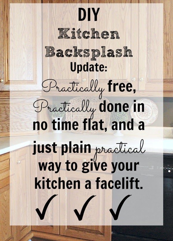
This post may contain affiliate links. Thank you for your support.

Here’s how it used to look.
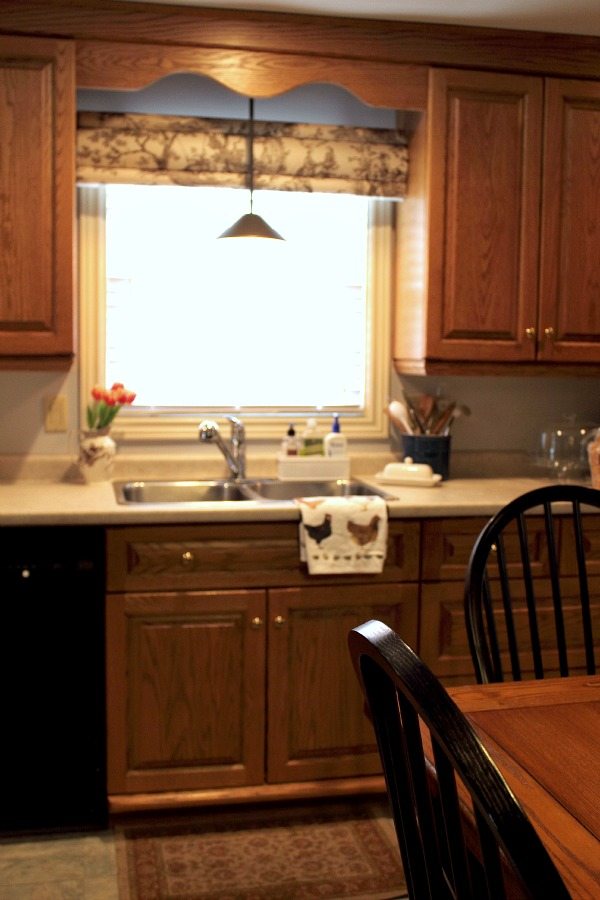
You know what? The kitchen overall is not entirely unpleasant. I know this, but for some reason, the eye just seems to want a focal point on the backsplash. Something to draw it in and make things a little more interesting. The eye wants what it wants!
I could go ahead and put some tile up. That would really help things. And I even love tiling! The problem is that I’d like to rip that counter top out sooner rather than later, and that would damage my tile work, so I’ll just have to wait and see what I can do to make the space a little cozier in the meantime.
So here’s how things are looking in the kitchen now!
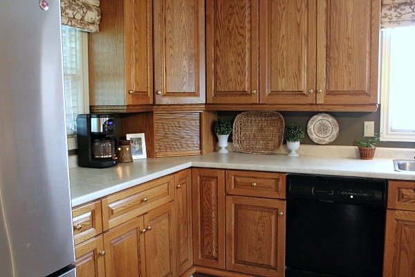
Wow! What a difference, right? The whole area suddenly seems so much more finished and complete. The eye is happy!
All I did was paint out the backsplash area with a little bit of paint left in the bottom of a sample pot (and clearly I didn’t even do too detailed of a job) and the difference it makes in the feel of the kitchen is tremendous. It’s one of those things that just brings out everything else around it. In fact, one of my mother-in-laws was here the other day and she just now noticed things like the new lighting and the cornices that have been up since February. Suddenly it looked like I had done a whole ton of work in there, but really all I did was take about an hour of my time one evening and slop a little paint on there.
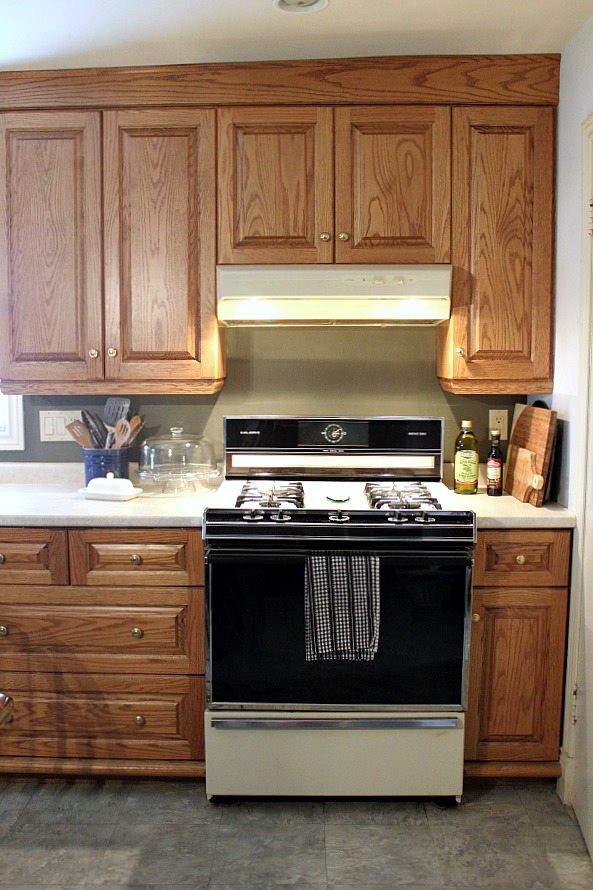
It even make the area around my super old range look a little more current.
So here’s why it works:
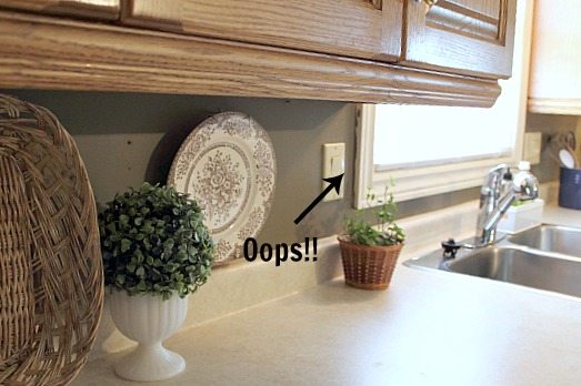
I used the concept of color blocking here and just painted on a solid block of color that isn’t found anywhere else in the room. That really just makes it a pop of the dark gray color rather than a continuation of something else from the room, and gives it that “backsplash” feel, since “real” backsplashes usually use a material that isn’t used anywhere else in the room.
Even though this color is a neutral (Martha Stewart Crevecoeur), it’s still a bold color and really makes a statement and draws the eye in.Wimpy colors just can’t do the heavy lifting, decor-wise, that’s needed to make up for the lack of a real solid tile or stone backsplash.
Contrast: If I would have picked a color too similar to the cabinetry or the counter, the effect would be lost.

So that’s how you can do something really simple like painting a tiny strip of wall, and get away with calling it a backsplash. If you don’t have anything on your backsplash, give this quick fix a try. You’ll be surprised at how much more you love the space afterwards!
Even if you have three different distinct colors of appliances from all different eras like I do…

Courtenay Hartford is the author of creeklinehouse.com, a blog based on her adventures renovating a 120-year-old farmhouse in rural Ontario, Canada. On her blog, Courtenay shares interior design tips based on her own farmhouse and her work as founder and stylist of the interior photography firm Art & Spaces. She also writes about her farmhouse garden, plant-based recipes, family travel, and homekeeping best practices. Courtenay is the author of the book The Cleaning Ninja and has been featured in numerous magazines including Country Sampler Farmhouse Style, Better Homes and Gardens, Parents Magazine, Real Simple, and Our Homes.
- Courtenay Hartford
- Courtenay Hartford
- Courtenay Hartford
- Courtenay Hartford
- Courtenay Hartford
- Courtenay Hartford
- Courtenay Hartford
- Courtenay Hartford
- Courtenay Hartford
- Courtenay Hartford
- Courtenay Hartford
- Courtenay Hartford
- Courtenay Hartford
- Courtenay Hartford
- Courtenay Hartford
- Courtenay Hartford
- Courtenay Hartford
- Courtenay Hartford
- Courtenay Hartford
- Courtenay Hartford
- Courtenay Hartford
- Courtenay Hartford
- Courtenay Hartford
- Courtenay Hartford
- Courtenay Hartford
- Courtenay Hartford
- Courtenay Hartford
- Courtenay Hartford
- Courtenay Hartford
- Courtenay Hartford
- Courtenay Hartford
- Courtenay Hartford
- Courtenay Hartford
- Courtenay Hartford
- Courtenay Hartford
- Courtenay Hartford
- Courtenay Hartford
- Courtenay Hartford
- Courtenay Hartford
- Courtenay Hartford
- Courtenay Hartford
- Courtenay Hartford
- Courtenay Hartford
- Courtenay Hartford
- Courtenay Hartford
- Courtenay Hartford
- Courtenay Hartford
- Courtenay Hartford
- Courtenay Hartford
- Courtenay Hartford
- Courtenay Hartford
- Courtenay Hartford
- Courtenay Hartford
- Courtenay Hartford
- Courtenay Hartford
- Courtenay Hartford
- Courtenay Hartford
- Courtenay Hartford
- Courtenay Hartford
- Courtenay Hartford
- Courtenay Hartford
- Courtenay Hartford
- Courtenay Hartford
- Courtenay Hartford
- Courtenay Hartford
- Courtenay Hartford
- Courtenay Hartford
- Courtenay Hartford
- Courtenay Hartford
- Courtenay Hartford
- Courtenay Hartford
- Courtenay Hartford
- Courtenay Hartford
- Courtenay Hartford
- Courtenay Hartford
- Courtenay Hartford
- Courtenay Hartford
- Courtenay Hartford
- Courtenay Hartford
- Courtenay Hartford
- Courtenay Hartford
- Courtenay Hartford
- Courtenay Hartford
- Courtenay Hartford
- Courtenay Hartford
- Courtenay Hartford
- Courtenay Hartford
- Courtenay Hartford
- Courtenay Hartford
- Courtenay Hartford
- Courtenay Hartford
- Courtenay Hartford
- Courtenay Hartford
- Courtenay Hartford
- Courtenay Hartford
- Courtenay Hartford
- Courtenay Hartford
- Courtenay Hartford
- Courtenay Hartford
- Courtenay Hartford
- Courtenay Hartford
- Courtenay Hartford
- Courtenay Hartford
- Courtenay Hartford
- Courtenay Hartford
- Courtenay Hartford
- Courtenay Hartford
- Courtenay Hartford
- Courtenay Hartford
- Courtenay Hartford
- Courtenay Hartford
- Courtenay Hartford
- Courtenay Hartford
- Courtenay Hartford
- Courtenay Hartford
- Courtenay Hartford
- Courtenay Hartford
- Courtenay Hartford
- Courtenay Hartford
- Courtenay Hartford
- Courtenay Hartford
- Courtenay Hartford
- Courtenay Hartford
- Courtenay Hartford
- Courtenay Hartford
- Courtenay Hartford
- Courtenay Hartford
- Courtenay Hartford
- Courtenay Hartford
- Courtenay Hartford
- Courtenay Hartford
- Courtenay Hartford
- Courtenay Hartford
- Courtenay Hartford
- Courtenay Hartford
- Courtenay Hartford
- Courtenay Hartford
- Courtenay Hartford
- Courtenay Hartford
- Courtenay Hartford
- Courtenay Hartford
- Courtenay Hartford
- Courtenay Hartford
- Courtenay Hartford
- Courtenay Hartford
- Courtenay Hartford
- Courtenay Hartford
- Courtenay Hartford
- Courtenay Hartford
- Courtenay Hartford
- Courtenay Hartford
- Courtenay Hartford
- Courtenay Hartford
- Courtenay Hartford
- Courtenay Hartford
- Courtenay Hartford
- Courtenay Hartford
- Courtenay Hartford
- Courtenay Hartford
- Courtenay Hartford
- Courtenay Hartford
- Courtenay Hartford
- Courtenay Hartford
- Courtenay Hartford
- Courtenay Hartford
- Courtenay Hartford
- Courtenay Hartford
- Courtenay Hartford
- Courtenay Hartford
- Courtenay Hartford
- Courtenay Hartford
- Courtenay Hartford
- Courtenay Hartford
- Courtenay Hartford
- Courtenay Hartford
- Courtenay Hartford
- Courtenay Hartford
- Courtenay Hartford
- Courtenay Hartford
- Courtenay Hartford
- Courtenay Hartford
- Courtenay Hartford
- Courtenay Hartford
- Courtenay Hartford
- Courtenay Hartford
- Courtenay Hartford
- Courtenay Hartford
- Courtenay Hartford
- Courtenay Hartford
- Courtenay Hartford
- Courtenay Hartford
- Courtenay Hartford
- Courtenay Hartford
- Courtenay Hartford
- Courtenay Hartford
- Courtenay Hartford
- Courtenay Hartford
- Courtenay Hartford
- Courtenay Hartford
- Courtenay Hartford
- Courtenay Hartford
- Courtenay Hartford
- Courtenay Hartford
- Courtenay Hartford
- Courtenay Hartford
- Courtenay Hartford
- Courtenay Hartford
- Courtenay Hartford
- Courtenay Hartford
- Courtenay Hartford
- Courtenay Hartford
- Courtenay Hartford
- Courtenay Hartford
- Courtenay Hartford
- Courtenay Hartford
- Courtenay Hartford
- Courtenay Hartford
- Courtenay Hartford
- Courtenay Hartford
- Courtenay Hartford
- Courtenay Hartford
- Courtenay Hartford
- Courtenay Hartford
- Courtenay Hartford
- Courtenay Hartford
- Courtenay Hartford
- Courtenay Hartford
- Courtenay Hartford
- Courtenay Hartford
- Courtenay Hartford
- Courtenay Hartford
- Courtenay Hartford
- Courtenay Hartford
- Courtenay Hartford
- Courtenay Hartford
- Courtenay Hartford
- Courtenay Hartford
- Courtenay Hartford
- Courtenay Hartford
- Courtenay Hartford
- Courtenay Hartford
- Courtenay Hartford
- Courtenay Hartford
- Courtenay Hartford
- Courtenay Hartford
- Courtenay Hartford
- Courtenay Hartford
- Courtenay Hartford
- Courtenay Hartford
- Courtenay Hartford
- Courtenay Hartford
- Courtenay Hartford
- Courtenay Hartford
- Courtenay Hartford
- Courtenay Hartford
- Courtenay Hartford
- Courtenay Hartford
- Courtenay Hartford
- Courtenay Hartford
- Courtenay Hartford
- Courtenay Hartford
- Courtenay Hartford
- Courtenay Hartford
- Courtenay Hartford
- Courtenay Hartford
- Courtenay Hartford
- Courtenay Hartford
- Courtenay Hartford
- Courtenay Hartford
- Courtenay Hartford
- Courtenay Hartford
- Courtenay Hartford
- Courtenay Hartford
- Courtenay Hartford
- Courtenay Hartford
- Courtenay Hartford
- Courtenay Hartford
- Courtenay Hartford
- Courtenay Hartford
- Courtenay Hartford
- Courtenay Hartford
- Courtenay Hartford
- Courtenay Hartford
- Courtenay Hartford
- Courtenay Hartford
- Courtenay Hartford
- Courtenay Hartford
- Courtenay Hartford
- Courtenay Hartford
- Courtenay Hartford
- Courtenay Hartford
- Courtenay Hartford
- Courtenay Hartford
- Courtenay Hartford
- Courtenay Hartford
- Courtenay Hartford
- Courtenay Hartford
- Courtenay Hartford
- Courtenay Hartford
- Courtenay Hartford
- Courtenay Hartford
- Courtenay Hartford
- Courtenay Hartford
- Courtenay Hartford
- Courtenay Hartford
- Courtenay Hartford
- Courtenay Hartford
- Courtenay Hartford
- Courtenay Hartford
- Courtenay Hartford
- Courtenay Hartford
- Courtenay Hartford
- Courtenay Hartford
- Courtenay Hartford
- Courtenay Hartford
- Courtenay Hartford
- Courtenay Hartford
- Courtenay Hartford
- Courtenay Hartford
- Courtenay Hartford
- Courtenay Hartford
- Courtenay Hartford
- Courtenay Hartford
- Courtenay Hartford
- Courtenay Hartford
- Courtenay Hartford
- Courtenay Hartford
- Courtenay Hartford
- Courtenay Hartford
- Courtenay Hartford
- Courtenay Hartford
- Courtenay Hartford
- Courtenay Hartford
- Courtenay Hartford
- Courtenay Hartford
- Courtenay Hartford
- Courtenay Hartford
- Courtenay Hartford
- Courtenay Hartford
- Courtenay Hartford
- Courtenay Hartford
- Courtenay Hartford
- Courtenay Hartford
- Courtenay Hartford
- Courtenay Hartford
- Courtenay Hartford
- Courtenay Hartford
- Courtenay Hartford
- Courtenay Hartford
- Courtenay Hartford
- Courtenay Hartford
- Courtenay Hartford
- Courtenay Hartford
- Courtenay Hartford
- Courtenay Hartford
- Courtenay Hartford
- Courtenay Hartford
- Courtenay Hartford
- Courtenay Hartford
- Courtenay Hartford
- Courtenay Hartford
- Courtenay Hartford
- Courtenay Hartford
- Courtenay Hartford
- Courtenay Hartford
- Courtenay Hartford
- Courtenay Hartford
- Courtenay Hartford
- Courtenay Hartford
- Courtenay Hartford
- Courtenay Hartford
- Courtenay Hartford
- Courtenay Hartford
- Courtenay Hartford
- Courtenay Hartford
- Courtenay Hartford
- Courtenay Hartford
- Courtenay Hartford
- Courtenay Hartford
- Courtenay Hartford
- Courtenay Hartford
- Courtenay Hartford
- Courtenay Hartford
- Courtenay Hartford
- Courtenay Hartford
- Courtenay Hartford
- Courtenay Hartford
- Courtenay Hartford
- Courtenay Hartford
- Courtenay Hartford
- Courtenay Hartford
- Courtenay Hartford
- Courtenay Hartford
- Courtenay Hartford
- Courtenay Hartford
- Courtenay Hartford
- Courtenay Hartford
- Courtenay Hartford
- Courtenay Hartford
- Courtenay Hartford
- Courtenay Hartford
- Courtenay Hartford
- Courtenay Hartford
- Courtenay Hartford
- Courtenay Hartford
- Courtenay Hartford
- Courtenay Hartford
- Courtenay Hartford
- Courtenay Hartford
- Courtenay Hartford
- Courtenay Hartford
- Courtenay Hartford
- Courtenay Hartford
- Courtenay Hartford
- Courtenay Hartford
- Courtenay Hartford
- Courtenay Hartford
- Courtenay Hartford
- Courtenay Hartford
- Courtenay Hartford
- Courtenay Hartford
- Courtenay Hartford
- Courtenay Hartford
- Courtenay Hartford
- Courtenay Hartford
- Courtenay Hartford
- Courtenay Hartford
- Courtenay Hartford
- Courtenay Hartford
- Courtenay Hartford
- Courtenay Hartford
- Courtenay Hartford
- Courtenay Hartford
- Courtenay Hartford
- Courtenay Hartford
- Courtenay Hartford
- Courtenay Hartford
- Courtenay Hartford
- Courtenay Hartford
- Courtenay Hartford
- Courtenay Hartford
- Courtenay Hartford
- Courtenay Hartford
- Courtenay Hartford
- Courtenay Hartford
- Courtenay Hartford
- Courtenay Hartford
- Courtenay Hartford
- Courtenay Hartford
- Courtenay Hartford
- Courtenay Hartford
- Courtenay Hartford
- Courtenay Hartford
- Courtenay Hartford
- Courtenay Hartford
- Courtenay Hartford
- Courtenay Hartford
- Courtenay Hartford
- Courtenay Hartford
- Courtenay Hartford
- Courtenay Hartford
- Courtenay Hartford
- Courtenay Hartford
- Courtenay Hartford
- Courtenay Hartford
- Courtenay Hartford
- Courtenay Hartford
- Courtenay Hartford
- Courtenay Hartford
- Courtenay Hartford
- Courtenay Hartford
- Courtenay Hartford
- Courtenay Hartford
- Courtenay Hartford
- Courtenay Hartford
- Courtenay Hartford
- Courtenay Hartford
- Courtenay Hartford
- Courtenay Hartford
- Courtenay Hartford
- Courtenay Hartford
- Courtenay Hartford
- Courtenay Hartford
- Courtenay Hartford
- Courtenay Hartford
- Courtenay Hartford
- Courtenay Hartford
- Courtenay Hartford
- Courtenay Hartford
- Courtenay Hartford
- Courtenay Hartford
- Courtenay Hartford
- Courtenay Hartford
- Courtenay Hartford
- Courtenay Hartford
- Courtenay Hartford
- Courtenay Hartford
- Courtenay Hartford
- Courtenay Hartford
- Courtenay Hartford
- Courtenay Hartford
- Courtenay Hartford
- Courtenay Hartford
- Courtenay Hartford
- Courtenay Hartford
- Courtenay Hartford
- Courtenay Hartford
- Courtenay Hartford
- Courtenay Hartford
- Courtenay Hartford
- Courtenay Hartford
- Courtenay Hartford
- Courtenay Hartford
- Courtenay Hartford
- Courtenay Hartford
- Courtenay Hartford
- Courtenay Hartford
- Courtenay Hartford
- Courtenay Hartford
- Courtenay Hartford
- Courtenay Hartford
- Courtenay Hartford
- Courtenay Hartford
- Courtenay Hartford
- Courtenay Hartford
- Courtenay Hartford
- Courtenay Hartford
- Courtenay Hartford
- Courtenay Hartford
- Courtenay Hartford
- Courtenay Hartford
- Courtenay Hartford
- Courtenay Hartford
- Courtenay Hartford
- Courtenay Hartford
- Courtenay Hartford
- Courtenay Hartford
- Courtenay Hartford
- Courtenay Hartford
- Courtenay Hartford
- Courtenay Hartford
- Courtenay Hartford
- Courtenay Hartford
- Courtenay Hartford
- Courtenay Hartford
- Courtenay Hartford
- Courtenay Hartford
- Courtenay Hartford
- Courtenay Hartford
- Courtenay Hartford
- Courtenay Hartford
- Courtenay Hartford
- Courtenay Hartford
- Courtenay Hartford
- Courtenay Hartford
- Courtenay Hartford
- Courtenay Hartford
- Courtenay Hartford
- Courtenay Hartford
- Courtenay Hartford
- Courtenay Hartford
- Courtenay Hartford
- Courtenay Hartford
- Courtenay Hartford
- Courtenay Hartford
- Courtenay Hartford
- Courtenay Hartford
- Courtenay Hartford
- Courtenay Hartford
- Courtenay Hartford
- Courtenay Hartford
- Courtenay Hartford
- Courtenay Hartford
- Courtenay Hartford
- Courtenay Hartford
- Courtenay Hartford
- Courtenay Hartford
- Courtenay Hartford
- Courtenay Hartford
- Courtenay Hartford
- Courtenay Hartford
- Courtenay Hartford
- Courtenay Hartford
- Courtenay Hartford
- Courtenay Hartford
- Courtenay Hartford
- Courtenay Hartford
- Courtenay Hartford
- Courtenay Hartford
- Courtenay Hartford
- Courtenay Hartford
- Courtenay Hartford
- Courtenay Hartford
- Courtenay Hartford
- Courtenay Hartford
- Courtenay Hartford
- Courtenay Hartford
- Courtenay Hartford
- Courtenay Hartford
- Courtenay Hartford
- Courtenay Hartford
- Courtenay Hartford
- Courtenay Hartford
- Courtenay Hartford
- Courtenay Hartford
- Courtenay Hartford
- Courtenay Hartford
- Courtenay Hartford
- Courtenay Hartford
- Courtenay Hartford
- Courtenay Hartford
- Courtenay Hartford
- Courtenay Hartford
- Courtenay Hartford
- Courtenay Hartford
- Courtenay Hartford
- Courtenay Hartford
- Courtenay Hartford
- Courtenay Hartford
- Courtenay Hartford
- Courtenay Hartford
- Courtenay Hartford
- Courtenay Hartford
- Courtenay Hartford
- Courtenay Hartford
- Courtenay Hartford
- Courtenay Hartford
- Courtenay Hartford
- Courtenay Hartford
- Courtenay Hartford
- Courtenay Hartford
- Courtenay Hartford
- Courtenay Hartford
- Courtenay Hartford
- Courtenay Hartford
- Courtenay Hartford
- Courtenay Hartford
- Courtenay Hartford
- Courtenay Hartford
- Courtenay Hartford
- Courtenay Hartford
- Courtenay Hartford
- Courtenay Hartford
- Courtenay Hartford
- Courtenay Hartford
- Courtenay Hartford
- Courtenay Hartford
- Courtenay Hartford
- Courtenay Hartford
- Courtenay Hartford
- Courtenay Hartford
- Courtenay Hartford
- Courtenay Hartford
- Courtenay Hartford
- Courtenay Hartford
- Courtenay Hartford
- Courtenay Hartford
- Courtenay Hartford
- Courtenay Hartford
- Courtenay Hartford
- Courtenay Hartford
- Courtenay Hartford
- Courtenay Hartford
- Courtenay Hartford
- Courtenay Hartford
- Courtenay Hartford
- Courtenay Hartford
- Courtenay Hartford
- Courtenay Hartford
- Courtenay Hartford
- Courtenay Hartford
- Courtenay Hartford
- Courtenay Hartford
- Courtenay Hartford
- Courtenay Hartford
- Courtenay Hartford
- Courtenay Hartford
- Courtenay Hartford
- Courtenay Hartford
- Courtenay Hartford
- Courtenay Hartford
- Courtenay Hartford
- Courtenay Hartford
- Courtenay Hartford
- Courtenay Hartford
- Courtenay Hartford
- Courtenay Hartford
- Courtenay Hartford
- Courtenay Hartford
- Courtenay Hartford
- Courtenay Hartford
- Courtenay Hartford
- Courtenay Hartford
- Courtenay Hartford
- Courtenay Hartford
- Courtenay Hartford
- Courtenay Hartford
- Courtenay Hartford
- Courtenay Hartford
- Courtenay Hartford
- Courtenay Hartford
- Courtenay Hartford
- Courtenay Hartford
- Courtenay Hartford
- Courtenay Hartford
- Courtenay Hartford
- Courtenay Hartford
- Courtenay Hartford
- Courtenay Hartford
- Courtenay Hartford
- Courtenay Hartford
- Courtenay Hartford
- Courtenay Hartford
- Courtenay Hartford
- Courtenay Hartford
- Courtenay Hartford
- Courtenay Hartford
- Courtenay Hartford
- Courtenay Hartford
- Courtenay Hartford
- Courtenay Hartford
- Courtenay Hartford
- Courtenay Hartford
- Courtenay Hartford
- Courtenay Hartford
- Courtenay Hartford
- Courtenay Hartford
- Courtenay Hartford
- Courtenay Hartford
- Courtenay Hartford
- Courtenay Hartford
- Courtenay Hartford
- Courtenay Hartford
- Courtenay Hartford
- Courtenay Hartford
- Courtenay Hartford
- Courtenay Hartford
- Courtenay Hartford
- Courtenay Hartford
- Courtenay Hartford
- Courtenay Hartford
- Courtenay Hartford
- Courtenay Hartford
- Courtenay Hartford
- Courtenay Hartford
- Courtenay Hartford
- Courtenay Hartford
- Courtenay Hartford
- Courtenay Hartford
- Courtenay Hartford
- Courtenay Hartford
- Courtenay Hartford
- Courtenay Hartford
- Courtenay Hartford
- Courtenay Hartford
- Courtenay Hartford
- Courtenay Hartford
- Courtenay Hartford
- Courtenay Hartford
- Courtenay Hartford
- Courtenay Hartford
- Courtenay Hartford
- Courtenay Hartford
- Courtenay Hartford
- Courtenay Hartford
- Courtenay Hartford
- Courtenay Hartford
- Courtenay Hartford
- Courtenay Hartford
- Courtenay Hartford
- Courtenay Hartford
- Courtenay Hartford
- Courtenay Hartford
- Courtenay Hartford
- Courtenay Hartford
- Courtenay Hartford
- Courtenay Hartford
- Courtenay Hartford
- Courtenay Hartford
- Courtenay Hartford
- Courtenay Hartford
- Courtenay Hartford
- Courtenay Hartford
- Courtenay Hartford
- Courtenay Hartford
- Courtenay Hartford
- Courtenay Hartford
- Courtenay Hartford
- Courtenay Hartford
- Courtenay Hartford
- Courtenay Hartford
- Courtenay Hartford
- Courtenay Hartford
- Courtenay Hartford
- Courtenay Hartford
- Courtenay Hartford
- Courtenay Hartford
- Courtenay Hartford
- Courtenay Hartford
- Courtenay Hartford
- Courtenay Hartford
- Courtenay Hartford
- Courtenay Hartford
- Courtenay Hartford
- Courtenay Hartford
- Courtenay Hartford
- Courtenay Hartford
- Courtenay Hartford
- Courtenay Hartford
- Courtenay Hartford
- Courtenay Hartford
- Courtenay Hartford
- Courtenay Hartford
- Courtenay Hartford
- Courtenay Hartford
- Courtenay Hartford
- Courtenay Hartford
- Courtenay Hartford
- Courtenay Hartford
- Courtenay Hartford
- Courtenay Hartford
- Courtenay Hartford
- Courtenay Hartford
- Courtenay Hartford
- Courtenay Hartford
- Courtenay Hartford
- Courtenay Hartford
- Courtenay Hartford
- Courtenay Hartford
- Courtenay Hartford
- Courtenay Hartford
- Courtenay Hartford
- Courtenay Hartford
- Courtenay Hartford
- Courtenay Hartford
- Courtenay Hartford
- Courtenay Hartford
- Courtenay Hartford
- Courtenay Hartford
- Courtenay Hartford
- Courtenay Hartford
- Courtenay Hartford
- Courtenay Hartford
- Courtenay Hartford
- Courtenay Hartford
- Courtenay Hartford
- Courtenay Hartford
- Courtenay Hartford
- Courtenay Hartford
- Courtenay Hartford
- Courtenay Hartford
- Courtenay Hartford
- Courtenay Hartford
- Courtenay Hartford
- Courtenay Hartford
- Courtenay Hartford
- Courtenay Hartford
- Courtenay Hartford
- Courtenay Hartford
- Courtenay Hartford
- Courtenay Hartford
- Courtenay Hartford
- Courtenay Hartford
- Courtenay Hartford
- Courtenay Hartford
- Courtenay Hartford
- Courtenay Hartford
- Courtenay Hartford
- Courtenay Hartford
- Courtenay Hartford
- Courtenay Hartford
- Courtenay Hartford
- Courtenay Hartford
- Courtenay Hartford
- Courtenay Hartford
- Courtenay Hartford
- Courtenay Hartford
- Courtenay Hartford
- Courtenay Hartford
- Courtenay Hartford
- Courtenay Hartford
- Courtenay Hartford
- Courtenay Hartford
- Courtenay Hartford
- Courtenay Hartford
- Courtenay Hartford
- Courtenay Hartford
- Courtenay Hartford
- Courtenay Hartford
- Courtenay Hartford
- Courtenay Hartford
- Courtenay Hartford
- Courtenay Hartford
- Courtenay Hartford
- Courtenay Hartford
- Courtenay Hartford
- Courtenay Hartford
- Courtenay Hartford
- Courtenay Hartford
- Courtenay Hartford
- Courtenay Hartford
- Courtenay Hartford
- Courtenay Hartford
- Courtenay Hartford
- Courtenay Hartford
- Courtenay Hartford
- Courtenay Hartford
- Courtenay Hartford
- Courtenay Hartford
- Courtenay Hartford
- Courtenay Hartford
- Courtenay Hartford
- Courtenay Hartford
- Courtenay Hartford
- Courtenay Hartford
- Courtenay Hartford
- Courtenay Hartford
- Courtenay Hartford
- Courtenay Hartford
- Courtenay Hartford
- Courtenay Hartford
- Courtenay Hartford
- Courtenay Hartford
- Courtenay Hartford
- Courtenay Hartford
- Courtenay Hartford
- Courtenay Hartford
- Courtenay Hartford
- Courtenay Hartford
- Courtenay Hartford
- Courtenay Hartford
- Courtenay Hartford
- Courtenay Hartford
- Courtenay Hartford
- Courtenay Hartford
- Courtenay Hartford
- Courtenay Hartford
- Courtenay Hartford
- Courtenay Hartford
- Courtenay Hartford
- Courtenay Hartford
- Courtenay Hartford
- Courtenay Hartford
- Courtenay Hartford
- Courtenay Hartford
- Courtenay Hartford
- Courtenay Hartford
- Courtenay Hartford
- Courtenay Hartford
- Courtenay Hartford
- Courtenay Hartford
- Courtenay Hartford
- Courtenay Hartford
- Courtenay Hartford
- Courtenay Hartford
- Courtenay Hartford
- Courtenay Hartford
- Courtenay Hartford
- Courtenay Hartford
- Courtenay Hartford
- Courtenay Hartford
- Courtenay Hartford
- Courtenay Hartford
- Courtenay Hartford
- Courtenay Hartford
- Courtenay Hartford
- Courtenay Hartford
- Courtenay Hartford
- Courtenay Hartford
- Courtenay Hartford
- Courtenay Hartford
- Courtenay Hartford
- Courtenay Hartford
- Courtenay Hartford
- Courtenay Hartford
- Courtenay Hartford
- Courtenay Hartford
- Courtenay Hartford
- Courtenay Hartford
- Courtenay Hartford
- Courtenay Hartford
- Courtenay Hartford
- Courtenay Hartford
- Courtenay Hartford
- Courtenay Hartford
- Courtenay Hartford
- Courtenay Hartford
- Courtenay Hartford
- Courtenay Hartford
- Courtenay Hartford
- Courtenay Hartford
- Courtenay Hartford
- Courtenay Hartford
- Courtenay Hartford
- Courtenay Hartford
- Courtenay Hartford
- Courtenay Hartford
- Courtenay Hartford
- Courtenay Hartford
- Courtenay Hartford
- Courtenay Hartford
- Courtenay Hartford
- Courtenay Hartford
- Courtenay Hartford
- Courtenay Hartford
- Courtenay Hartford
- Courtenay Hartford
- Courtenay Hartford
- Courtenay Hartford
- Courtenay Hartford
- Courtenay Hartford
- Courtenay Hartford
- Courtenay Hartford
- Courtenay Hartford
- Courtenay Hartford
- Courtenay Hartford
- Courtenay Hartford
- Courtenay Hartford
- Courtenay Hartford
- Courtenay Hartford
- Courtenay Hartford
- Courtenay Hartford
- Courtenay Hartford
- Courtenay Hartford
- Courtenay Hartford
- Courtenay Hartford
- Courtenay Hartford
- Courtenay Hartford
- Courtenay Hartford
- Courtenay Hartford
- Courtenay Hartford
- Courtenay Hartford
- Courtenay Hartford
- Courtenay Hartford
- Courtenay Hartford
- Courtenay Hartford
- Courtenay Hartford
- Courtenay Hartford
- Courtenay Hartford
- Courtenay Hartford
- Courtenay Hartford
- Courtenay Hartford
- Courtenay Hartford
- Courtenay Hartford
- Courtenay Hartford
- Courtenay Hartford
- Courtenay Hartford
- Courtenay Hartford
- Courtenay Hartford
- Courtenay Hartford
- Courtenay Hartford
- Courtenay Hartford
- Courtenay Hartford
- Courtenay Hartford
- Courtenay Hartford
- Courtenay Hartford
- Courtenay Hartford
- Courtenay Hartford
- Courtenay Hartford
- Courtenay Hartford
- Courtenay Hartford
- Courtenay Hartford
- Courtenay Hartford
- Courtenay Hartford
- Courtenay Hartford
- Courtenay Hartford
- Courtenay Hartford
- Courtenay Hartford
- Courtenay Hartford
- Courtenay Hartford
- Courtenay Hartford
- Courtenay Hartford
- Courtenay Hartford
- Courtenay Hartford
- Courtenay Hartford
- Courtenay Hartford
- Courtenay Hartford
- Courtenay Hartford
- Courtenay Hartford
- Courtenay Hartford
- Courtenay Hartford
- Courtenay Hartford
- Courtenay Hartford
- Courtenay Hartford
- Courtenay Hartford
- Courtenay Hartford
- Courtenay Hartford
- Courtenay Hartford
- Courtenay Hartford
- Courtenay Hartford
- Courtenay Hartford
- Courtenay Hartford
- Courtenay Hartford
- Courtenay Hartford
- Courtenay Hartford
- Courtenay Hartford
- Courtenay Hartford
- Courtenay Hartford
- Courtenay Hartford
- Courtenay Hartford
- Courtenay Hartford
- Courtenay Hartford
- Courtenay Hartford
- Courtenay Hartford
- Courtenay Hartford
- Courtenay Hartford
- Courtenay Hartford
- Courtenay Hartford
- Courtenay Hartford
- Courtenay Hartford
- Courtenay Hartford
- Courtenay Hartford
- Courtenay Hartford
- Courtenay Hartford
- Courtenay Hartford
- Courtenay Hartford
- Courtenay Hartford
- Courtenay Hartford
- Courtenay Hartford
- Courtenay Hartford
- Courtenay Hartford
- Courtenay Hartford
- Courtenay Hartford
- Courtenay Hartford
- Courtenay Hartford
- Courtenay Hartford
- Courtenay Hartford
- Courtenay Hartford
- Courtenay Hartford
- Courtenay Hartford
- Courtenay Hartford
- Courtenay Hartford
- Courtenay Hartford
- Courtenay Hartford
- Courtenay Hartford
- Courtenay Hartford
- Courtenay Hartford
- Courtenay Hartford
- Courtenay Hartford
- Courtenay Hartford
- Courtenay Hartford
- Courtenay Hartford
- Courtenay Hartford
- Courtenay Hartford
- Courtenay Hartford
- Courtenay Hartford
- Courtenay Hartford
- Courtenay Hartford
- Courtenay Hartford
- Courtenay Hartford
- Courtenay Hartford
- Courtenay Hartford
- Courtenay Hartford
- Courtenay Hartford
- Courtenay Hartford
- Courtenay Hartford
- Courtenay Hartford
- Courtenay Hartford
- Courtenay Hartford
- Courtenay Hartford
- Courtenay Hartford
- Courtenay Hartford
- Courtenay Hartford
- Courtenay Hartford
- Courtenay Hartford
- Courtenay Hartford
- Courtenay Hartford
- Courtenay Hartford
- Courtenay Hartford
- Courtenay Hartford
- Courtenay Hartford
- Courtenay Hartford
- Courtenay Hartford
- Courtenay Hartford
- Courtenay Hartford
- Courtenay Hartford
- Courtenay Hartford
- Courtenay Hartford
- Courtenay Hartford
- Courtenay Hartford
- Courtenay Hartford
- Courtenay Hartford
- Courtenay Hartford
- Courtenay Hartford
- Courtenay Hartford
- Courtenay Hartford
- Courtenay Hartford
- Courtenay Hartford
- Courtenay Hartford
- Courtenay Hartford
- Courtenay Hartford
- Courtenay Hartford
- Courtenay Hartford
- Courtenay Hartford
- Courtenay Hartford
- Courtenay Hartford
- Courtenay Hartford
- Courtenay Hartford
- Courtenay Hartford
- Courtenay Hartford
- Courtenay Hartford
- Courtenay Hartford
- Courtenay Hartford
- Courtenay Hartford
- Courtenay Hartford
- Courtenay Hartford
- Courtenay Hartford
- Courtenay Hartford
- Courtenay Hartford
- Courtenay Hartford
- Courtenay Hartford
- Courtenay Hartford
- Courtenay Hartford
- Courtenay Hartford
- Courtenay Hartford
- Courtenay Hartford
- Courtenay Hartford
- Courtenay Hartford
- Courtenay Hartford
- Courtenay Hartford
- Courtenay Hartford
- Courtenay Hartford
- Courtenay Hartford
- Courtenay Hartford
- Courtenay Hartford
- Courtenay Hartford
- Courtenay Hartford
- Courtenay Hartford
- Courtenay Hartford
- Courtenay Hartford
- Courtenay Hartford
- Courtenay Hartford
- Courtenay Hartford
- Courtenay Hartford
- Courtenay Hartford
- Courtenay Hartford
- Courtenay Hartford
- Courtenay Hartford
- Courtenay Hartford
- Courtenay Hartford
- Courtenay Hartford
- Courtenay Hartford
- Courtenay Hartford
- Courtenay Hartford
- Courtenay Hartford
- Courtenay Hartford
- Courtenay Hartford
- Courtenay Hartford
- Courtenay Hartford
- Courtenay Hartford
- Courtenay Hartford
- Courtenay Hartford
- Courtenay Hartford
- Courtenay Hartford
- Courtenay Hartford
- Courtenay Hartford
- Courtenay Hartford
- Courtenay Hartford
- Courtenay Hartford
- Courtenay Hartford
- Courtenay Hartford
- Courtenay Hartford
- Courtenay Hartford
- Courtenay Hartford
- Courtenay Hartford
- Courtenay Hartford
- Courtenay Hartford
- Courtenay Hartford
- Courtenay Hartford
- Courtenay Hartford
- Courtenay Hartford
- Courtenay Hartford
- Courtenay Hartford
- Courtenay Hartford
- Courtenay Hartford
- Courtenay Hartford
- Courtenay Hartford
- Courtenay Hartford
- Courtenay Hartford
- Courtenay Hartford
- Courtenay Hartford
- Courtenay Hartford
- Courtenay Hartford
- Courtenay Hartford
- Courtenay Hartford
- Courtenay Hartford
- Courtenay Hartford
- Courtenay Hartford
- Courtenay Hartford
- Courtenay Hartford
- Courtenay Hartford
- Courtenay Hartford
- Courtenay Hartford
- Courtenay Hartford
- Courtenay Hartford
- Courtenay Hartford
- Courtenay Hartford
- Courtenay Hartford
- Courtenay Hartford
- Courtenay Hartford
- Courtenay Hartford
- Courtenay Hartford
- Courtenay Hartford
- Courtenay Hartford
- Courtenay Hartford
- Courtenay Hartford
- Courtenay Hartford
- Courtenay Hartford
- Courtenay Hartford
- Courtenay Hartford
- Courtenay Hartford
- Courtenay Hartford
- Courtenay Hartford
- Courtenay Hartford
- Courtenay Hartford
- Courtenay Hartford
- Courtenay Hartford
- Courtenay Hartford
- Courtenay Hartford
- Courtenay Hartford
- Courtenay Hartford
- Courtenay Hartford
- Courtenay Hartford
- Courtenay Hartford
- Courtenay Hartford
- Courtenay Hartford
- Courtenay Hartford
- Courtenay Hartford
- Courtenay Hartford
- Courtenay Hartford
- Courtenay Hartford
- Courtenay Hartford
- Courtenay Hartford
- Courtenay Hartford
- Courtenay Hartford
- Courtenay Hartford
- Courtenay Hartford
- Courtenay Hartford
- Courtenay Hartford
- Courtenay Hartford
- Courtenay Hartford
- Courtenay Hartford
- Courtenay Hartford
- Courtenay Hartford
- Courtenay Hartford
- Courtenay Hartford
- Courtenay Hartford
- Courtenay Hartford
- Courtenay Hartford
- Courtenay Hartford
- Courtenay Hartford
- Courtenay Hartford
- Courtenay Hartford
- Courtenay Hartford
- Courtenay Hartford
- Courtenay Hartford
- Courtenay Hartford
- Courtenay Hartford
- Courtenay Hartford
- Courtenay Hartford
- Courtenay Hartford
- Courtenay Hartford
- Courtenay Hartford
- Courtenay Hartford
- Courtenay Hartford
- Courtenay Hartford
- Courtenay Hartford
- Courtenay Hartford
- Courtenay Hartford
- Courtenay Hartford
- Courtenay Hartford
- Courtenay Hartford
- Courtenay Hartford
- Courtenay Hartford
- Courtenay Hartford
- Courtenay Hartford
- Courtenay Hartford
- Courtenay Hartford
- Courtenay Hartford
- Courtenay Hartford
- Courtenay Hartford
- Courtenay Hartford
- Courtenay Hartford
- Courtenay Hartford
- Courtenay Hartford
- Courtenay Hartford
- Courtenay Hartford
- Courtenay Hartford
- Courtenay Hartford
- Courtenay Hartford
- Courtenay Hartford
- Courtenay Hartford
- Courtenay Hartford
- Courtenay Hartford
- Courtenay Hartford
- Courtenay Hartford
- Courtenay Hartford
- Courtenay Hartford
- Courtenay Hartford
- Courtenay Hartford
- Courtenay Hartford
- Courtenay Hartford
- Courtenay Hartford
- Courtenay Hartford
- Courtenay Hartford
- Courtenay Hartford
- Courtenay Hartford
- Courtenay Hartford
- Courtenay Hartford
- Courtenay Hartford
- Courtenay Hartford
- Courtenay Hartford
- Courtenay Hartford
- Courtenay Hartford
- Courtenay Hartford
- Courtenay Hartford
- Courtenay Hartford
- Courtenay Hartford
- Courtenay Hartford
- Courtenay Hartford
- Courtenay Hartford
- Courtenay Hartford
- Courtenay Hartford
- Courtenay Hartford
- Courtenay Hartford
- Courtenay Hartford
- Courtenay Hartford
- Courtenay Hartford
- Courtenay Hartford
- Courtenay Hartford
- Courtenay Hartford
- Courtenay Hartford
- Courtenay Hartford
- Courtenay Hartford
- Courtenay Hartford
- Courtenay Hartford
- Courtenay Hartford
- Courtenay Hartford
- Courtenay Hartford
- Courtenay Hartford
- Courtenay Hartford
- Courtenay Hartford
- Courtenay Hartford
- Courtenay Hartford
- Courtenay Hartford
- Courtenay Hartford
- Courtenay Hartford
- Courtenay Hartford
- Courtenay Hartford
- Courtenay Hartford
- Courtenay Hartford
- Courtenay Hartford
- Courtenay Hartford
- Courtenay Hartford
- Courtenay Hartford
- Courtenay Hartford
- Courtenay Hartford
- Courtenay Hartford
- Courtenay Hartford
- Courtenay Hartford
- Courtenay Hartford
- Courtenay Hartford
- Courtenay Hartford
- Courtenay Hartford
- Courtenay Hartford
- Courtenay Hartford
- Courtenay Hartford
- Courtenay Hartford
- Courtenay Hartford
- Courtenay Hartford
- Courtenay Hartford
- Courtenay Hartford
- Courtenay Hartford
- Courtenay Hartford
- Courtenay Hartford
- Courtenay Hartford
- Courtenay Hartford
- Courtenay Hartford
- Courtenay Hartford
- Courtenay Hartford
- Courtenay Hartford
- Courtenay Hartford
- Courtenay Hartford
- Courtenay Hartford
- Courtenay Hartford
- Courtenay Hartford
- Courtenay Hartford
- Courtenay Hartford
- Courtenay Hartford
- Courtenay Hartford
- Courtenay Hartford
- Courtenay Hartford
- Courtenay Hartford
- Courtenay Hartford
- Courtenay Hartford
- Courtenay Hartford
- Courtenay Hartford
- Courtenay Hartford
- Courtenay Hartford
- Courtenay Hartford
- Courtenay Hartford
- Courtenay Hartford
- Courtenay Hartford
- Courtenay Hartford
- Courtenay Hartford
- Courtenay Hartford
- Courtenay Hartford
- Courtenay Hartford
- Courtenay Hartford
- Courtenay Hartford
- Courtenay Hartford
- Courtenay Hartford
- Courtenay Hartford
- Courtenay Hartford
- Courtenay Hartford
- Courtenay Hartford
- Courtenay Hartford
- Courtenay Hartford
- Courtenay Hartford
- Courtenay Hartford
- Courtenay Hartford
- Courtenay Hartford
- Courtenay Hartford
- Courtenay Hartford
- Courtenay Hartford
- Courtenay Hartford
- Courtenay Hartford
- Courtenay Hartford
- Courtenay Hartford
- Courtenay Hartford
- Courtenay Hartford
- Courtenay Hartford
- Courtenay Hartford
- Courtenay Hartford
- Courtenay Hartford
- Courtenay Hartford
- Courtenay Hartford
- Courtenay Hartford
- Courtenay Hartford
- Courtenay Hartford
- Courtenay Hartford
- Courtenay Hartford
- Courtenay Hartford
- Courtenay Hartford
- Courtenay Hartford
- Courtenay Hartford
- Courtenay Hartford
- Courtenay Hartford
- Courtenay Hartford
- Courtenay Hartford
- Courtenay Hartford
- Courtenay Hartford
- Courtenay Hartford