This post may contain affiliate links. Thank you for your support.
I could never find the perfect gold frame, so I came up with my own method to paint them myself! Here’s my secret formula for the perfect painted gold frame.
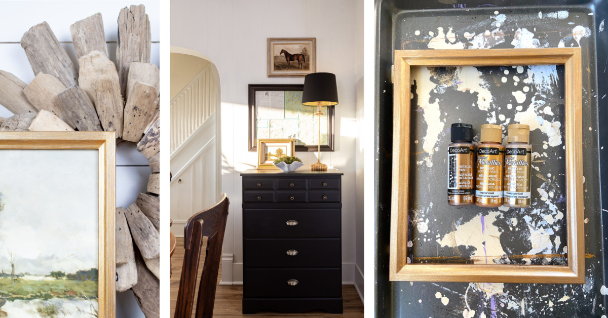
I love the classic look of a painting in a gold frame, and I’m so happy to see that matted antique gold picture frames are really having a moment right now. The problem with ready-made gilded photo frames being so widely available and on-trend is that most of them are not very high-quality. A cheap plastic frame will always look like a cheap plastic frame, unfortunately, even if it’s slightly distressed and made to be a replica of a vintage-style wood frame. If you’re just going to be framing a print for decorative purposes, the cost of a custom frame made from beautifully finished wood molding might not be appropriate, but you can make your own painted gold frame with this method. The process is easy and affordable, but the result is beautiful enough for displaying alongside your best antique silver frames, beaded walnut frames, and cherished family vintage photo keepsakes.
More ideas to help you decorate: My Favorite Inexpensive Decorating Tricks
The Search for the Perfect Gold Frame
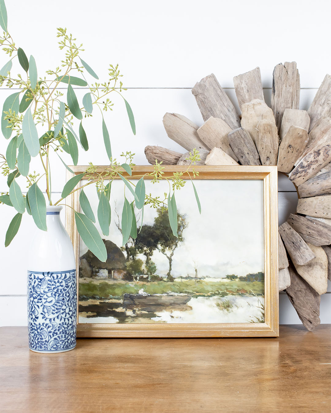
When I first started searching for the perfect gold frame, I had something quite specific in mind before I discovered that I could paint my own. What I really wanted was a rectangular wood picture frame with the look of an antique frame that wasn’t too shiny, wasn’t too modern, but also wasn’t too ornate, carved, or baroque style. Something simple, maybe beveled, but with a feeling of a bit of history behind it that would be appropriate to display with the authentic vintage gold metal picture frames I always search out at thrift stores and secondhand shops. And also something in an 8×10 size or larger, that I could mat to 8×10. I also wanted to find more of a larger-scale, long-term solution because I had several walls that I wanted to fill with art. So a one-off gold-leaf find at a flea market wasn’t going to cut it.
I find most gallery frames and poster frames that are easy to find and relatively affordable are either lower quality or they are just a bit simpler and more modern in style than the beautiful wooden-frame options I’m looking for when decorating our 1oo+-year-old farmhouse.
I played around while painting these frames that you can see in the mudroom, pictured here a few years ago, and then I really zeroed in on my perfect formula.
Read next: How to Clean Used Furniture From the Thrift Store
The Secret Formula for the Painted Gold Picture Frame
As with all good things, the solution to the perfect gold frame paint finish was pretty simple. All it took was a trip to the Michaels paint section to buy and test just about every little bottle of gold paint that they had. I was up for the challenge. 🙂
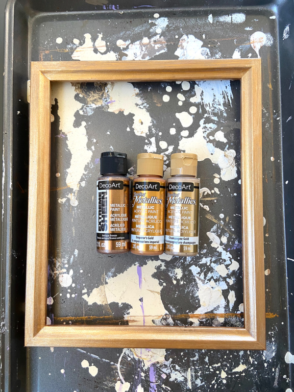
As it turns out, the solution I needed wasn’t to find the one perfect gold paint but rather to use three different ones in a specific order.
So here’s what I do:
- One coat of Antique Bronze paint (a dark gold metallic brown)
- One coat of Emperor’s Gold paint (a more orangey-gold)
- One coat of Champagne Gold paint (a very non-orangey gold)
The Perfect Painted Gold Frame in Progress

Here you can see how a frame looks when it’s partially painted. You can see the whole frame has been painted with the bronze paint, and I’ve moved on to the next coat of warm gold paint in one section. Each layer of paint really adds to the depth and beauty of the finish.
The key to success is to use a brush with bristles to create textured wood-grain finishes instead of a foam brush because you really want to see the texture of the brush strokes. This gives it more of an aged feel and makes it feel less like a cheapo paint job. It’s also really important to keep your brush strokes straight and keep the coats of paint very thin so you don’t get the paint globbing up in the corners. It turns out that “globbing” isn’t a real word, but you get what I mean.
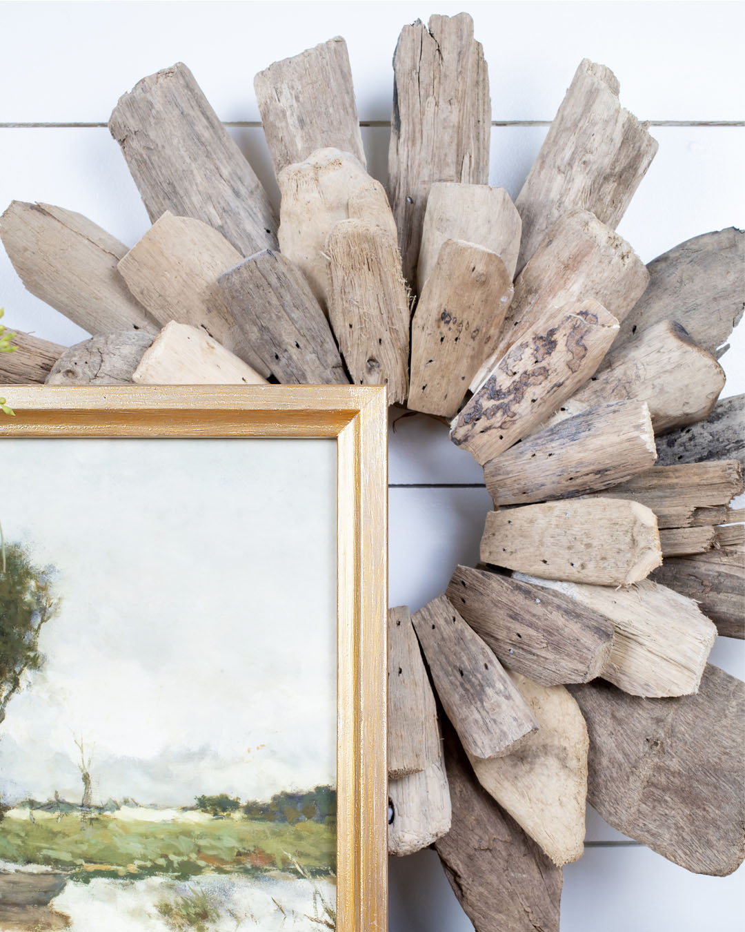
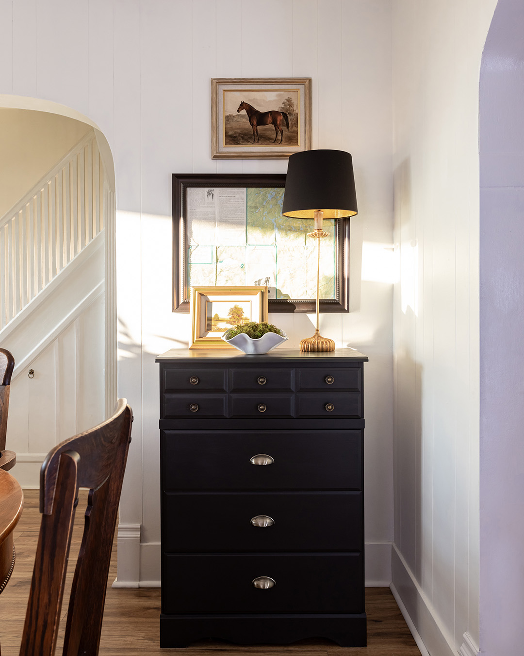
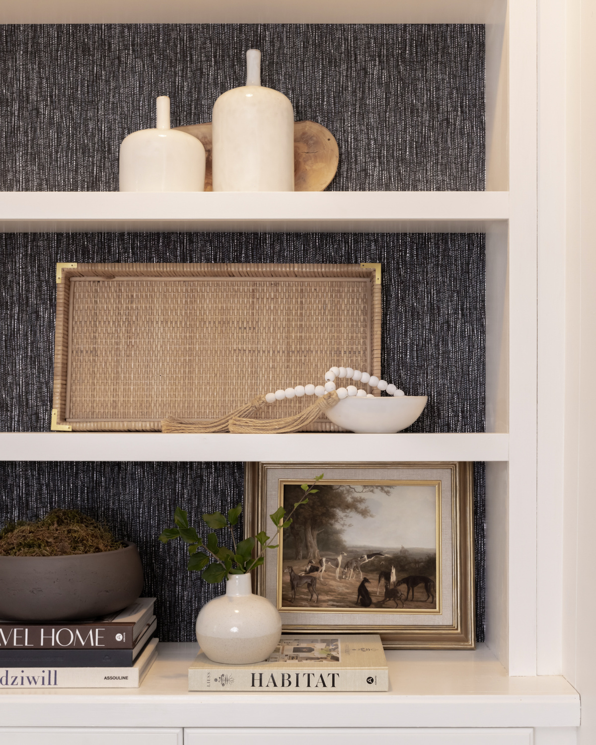
Here’s the overall look of one of the frames with a print in it.
More home decor to compliment your favorite fine-art pieces, vases, and curtains: No-Fail Etsy Pillow Finds to Mix and Match
The Best Type of Frame to Paint Gold
I’ve used this method on all different types of frames with some level of success. I’ve tried it on a simple, modern gallery frame made of plastic, and a more ornate frame with a lot of detail. This burnished paint finish works beautifully to elevate any type of frame that you could choose to decorate your home with, whether they’re square, rectangular, or an oval frame, but over time, I’ve landed on some favorite styles that I think deliver the best classic frame look.
Most of the time, I have the most success finding good frames to paint at the thrift store. I look for solid, real wood frames with a traditional molding style with a bit of detail, but not too much. Something very basic doesn’t catch the light quite as nicely, and I think the end result can be a little silly and opulent looking if the frame has too much detail. I love painting black picture frames or a nice dark wood instead of white picture frames because these give the final finish a bit of depth. The black frame doesn’t necessarily show through, but it darkens the paint finish’s overall color a bit and gives it a more authentic, traditional look.
I’ve had a lot of luck finding frames that seem to be leftovers from old frame shops. They sometimes have a fabric insert as part of the frame, and these add a beautiful detail and kind of add the effect of matting. These vintage wood frames are usually found as just the wooden outer part of the frame, with no glass insert or backing, so I need to get a bit creative when it comes to actually adding a print, but a little painter’s tape and a piece of cardboard usually does the trick. You can’t always control the frame sizes that you come across, so I just always look out for beautiful frames of any size, along with my favorite style of antique brass frame, and hold onto them until I find a use for them.
The lack of hanging hardware makes it difficult to hang these second-hand frames vertically or horizontally, so I often display them leaned up on a tabletop or shelf, although Command strips are also a great option.
You can find some examples of the vintage-style prints that I like to buy to use in these frames in this post that goes more in-depth into choosing art to use in these gold frames: DIY Framed Vintage Art Prints
These timeless frames are perfect for any photo display, for mirrors, to upcycle your old picture frames, or to add elegance to a gallery wall.
More practical DIY decorating inspiration: The 10 Minute DIY Pillow Cover

Courtenay Hartford is the author of creeklinehouse.com, a blog based on her adventures renovating a 120-year-old farmhouse in rural Ontario, Canada. On her blog, Courtenay shares interior design tips based on her own farmhouse and her work as founder and stylist of the interior photography firm Art & Spaces. She also writes about her farmhouse garden, plant-based recipes, family travel, and homekeeping best practices. Courtenay is the author of the book The Cleaning Ninja and has been featured in numerous magazines including Country Sampler Farmhouse Style, Better Homes and Gardens, Parents Magazine, Real Simple, and Our Homes.
- Courtenay Hartford
- Courtenay Hartford
- Courtenay Hartford
- Courtenay Hartford
- Courtenay Hartford
- Courtenay Hartford
- Courtenay Hartford
- Courtenay Hartford
- Courtenay Hartford
- Courtenay Hartford
- Courtenay Hartford
- Courtenay Hartford
- Courtenay Hartford
- Courtenay Hartford
- Courtenay Hartford
- Courtenay Hartford
- Courtenay Hartford
- Courtenay Hartford
- Courtenay Hartford
- Courtenay Hartford
- Courtenay Hartford
- Courtenay Hartford
- Courtenay Hartford
- Courtenay Hartford
- Courtenay Hartford
- Courtenay Hartford
- Courtenay Hartford
- Courtenay Hartford
- Courtenay Hartford
- Courtenay Hartford
- Courtenay Hartford
- Courtenay Hartford
- Courtenay Hartford
- Courtenay Hartford
- Courtenay Hartford
- Courtenay Hartford
- Courtenay Hartford
- Courtenay Hartford
- Courtenay Hartford
- Courtenay Hartford
- Courtenay Hartford
- Courtenay Hartford
- Courtenay Hartford
- Courtenay Hartford
- Courtenay Hartford
- Courtenay Hartford
- Courtenay Hartford
- Courtenay Hartford
- Courtenay Hartford
- Courtenay Hartford
- Courtenay Hartford
- Courtenay Hartford
- Courtenay Hartford
- Courtenay Hartford
- Courtenay Hartford
- Courtenay Hartford
- Courtenay Hartford
- Courtenay Hartford
- Courtenay Hartford
- Courtenay Hartford
- Courtenay Hartford
- Courtenay Hartford
- Courtenay Hartford
- Courtenay Hartford
- Courtenay Hartford
- Courtenay Hartford
- Courtenay Hartford
- Courtenay Hartford
- Courtenay Hartford
- Courtenay Hartford
- Courtenay Hartford
- Courtenay Hartford
- Courtenay Hartford
- Courtenay Hartford
- Courtenay Hartford
- Courtenay Hartford
- Courtenay Hartford
- Courtenay Hartford
- Courtenay Hartford
- Courtenay Hartford
- Courtenay Hartford
- Courtenay Hartford
- Courtenay Hartford
- Courtenay Hartford
- Courtenay Hartford
- Courtenay Hartford
- Courtenay Hartford
- Courtenay Hartford
- Courtenay Hartford
- Courtenay Hartford
- Courtenay Hartford
- Courtenay Hartford
- Courtenay Hartford
- Courtenay Hartford
- Courtenay Hartford
- Courtenay Hartford
- Courtenay Hartford
- Courtenay Hartford
- Courtenay Hartford
- Courtenay Hartford
- Courtenay Hartford
- Courtenay Hartford
- Courtenay Hartford
- Courtenay Hartford
- Courtenay Hartford
- Courtenay Hartford
- Courtenay Hartford
- Courtenay Hartford
- Courtenay Hartford
- Courtenay Hartford
- Courtenay Hartford
- Courtenay Hartford
- Courtenay Hartford
- Courtenay Hartford
- Courtenay Hartford
- Courtenay Hartford
- Courtenay Hartford
- Courtenay Hartford
- Courtenay Hartford
- Courtenay Hartford
- Courtenay Hartford
- Courtenay Hartford
- Courtenay Hartford
- Courtenay Hartford
- Courtenay Hartford
- Courtenay Hartford
- Courtenay Hartford
- Courtenay Hartford
- Courtenay Hartford
- Courtenay Hartford
- Courtenay Hartford
- Courtenay Hartford
- Courtenay Hartford
- Courtenay Hartford
- Courtenay Hartford
- Courtenay Hartford
- Courtenay Hartford
- Courtenay Hartford
- Courtenay Hartford
- Courtenay Hartford
- Courtenay Hartford
- Courtenay Hartford
- Courtenay Hartford
- Courtenay Hartford
- Courtenay Hartford
- Courtenay Hartford
- Courtenay Hartford
- Courtenay Hartford
- Courtenay Hartford
- Courtenay Hartford
- Courtenay Hartford
- Courtenay Hartford
- Courtenay Hartford
- Courtenay Hartford
- Courtenay Hartford
- Courtenay Hartford
- Courtenay Hartford
- Courtenay Hartford
- Courtenay Hartford
- Courtenay Hartford
- Courtenay Hartford
- Courtenay Hartford
- Courtenay Hartford
- Courtenay Hartford
- Courtenay Hartford
- Courtenay Hartford
- Courtenay Hartford
- Courtenay Hartford
- Courtenay Hartford
- Courtenay Hartford
- Courtenay Hartford
- Courtenay Hartford
- Courtenay Hartford
- Courtenay Hartford
- Courtenay Hartford
- Courtenay Hartford
- Courtenay Hartford
- Courtenay Hartford
- Courtenay Hartford
- Courtenay Hartford
- Courtenay Hartford
- Courtenay Hartford
- Courtenay Hartford
- Courtenay Hartford
- Courtenay Hartford
- Courtenay Hartford
- Courtenay Hartford
- Courtenay Hartford
- Courtenay Hartford
- Courtenay Hartford
- Courtenay Hartford
- Courtenay Hartford
- Courtenay Hartford
- Courtenay Hartford
- Courtenay Hartford
- Courtenay Hartford
- Courtenay Hartford
- Courtenay Hartford
- Courtenay Hartford
- Courtenay Hartford
- Courtenay Hartford
- Courtenay Hartford
- Courtenay Hartford
- Courtenay Hartford
- Courtenay Hartford
- Courtenay Hartford
- Courtenay Hartford
- Courtenay Hartford
- Courtenay Hartford
- Courtenay Hartford
- Courtenay Hartford
- Courtenay Hartford
- Courtenay Hartford
- Courtenay Hartford
- Courtenay Hartford
- Courtenay Hartford
- Courtenay Hartford
- Courtenay Hartford
- Courtenay Hartford
- Courtenay Hartford
- Courtenay Hartford
- Courtenay Hartford
- Courtenay Hartford
- Courtenay Hartford
- Courtenay Hartford
- Courtenay Hartford
- Courtenay Hartford
- Courtenay Hartford
- Courtenay Hartford
- Courtenay Hartford
- Courtenay Hartford
- Courtenay Hartford
- Courtenay Hartford
- Courtenay Hartford
- Courtenay Hartford
- Courtenay Hartford
- Courtenay Hartford
- Courtenay Hartford
- Courtenay Hartford
- Courtenay Hartford
- Courtenay Hartford
- Courtenay Hartford
- Courtenay Hartford
- Courtenay Hartford
- Courtenay Hartford
- Courtenay Hartford
- Courtenay Hartford
- Courtenay Hartford
- Courtenay Hartford
- Courtenay Hartford
- Courtenay Hartford
- Courtenay Hartford
- Courtenay Hartford
- Courtenay Hartford
- Courtenay Hartford
- Courtenay Hartford
- Courtenay Hartford
- Courtenay Hartford
- Courtenay Hartford
- Courtenay Hartford
- Courtenay Hartford
- Courtenay Hartford
- Courtenay Hartford
- Courtenay Hartford
- Courtenay Hartford
- Courtenay Hartford
- Courtenay Hartford
- Courtenay Hartford
- Courtenay Hartford
- Courtenay Hartford
- Courtenay Hartford
- Courtenay Hartford
- Courtenay Hartford
- Courtenay Hartford
- Courtenay Hartford
- Courtenay Hartford
- Courtenay Hartford
- Courtenay Hartford
- Courtenay Hartford
- Courtenay Hartford
- Courtenay Hartford
- Courtenay Hartford
- Courtenay Hartford
- Courtenay Hartford
- Courtenay Hartford
- Courtenay Hartford
- Courtenay Hartford
- Courtenay Hartford
- Courtenay Hartford
- Courtenay Hartford
- Courtenay Hartford
- Courtenay Hartford
- Courtenay Hartford
- Courtenay Hartford
- Courtenay Hartford
- Courtenay Hartford
- Courtenay Hartford
- Courtenay Hartford
- Courtenay Hartford
- Courtenay Hartford
- Courtenay Hartford
- Courtenay Hartford
- Courtenay Hartford
- Courtenay Hartford
- Courtenay Hartford
- Courtenay Hartford
- Courtenay Hartford
- Courtenay Hartford
- Courtenay Hartford
- Courtenay Hartford
- Courtenay Hartford
- Courtenay Hartford
- Courtenay Hartford
- Courtenay Hartford
- Courtenay Hartford
- Courtenay Hartford
- Courtenay Hartford
- Courtenay Hartford
- Courtenay Hartford
- Courtenay Hartford
- Courtenay Hartford
- Courtenay Hartford
- Courtenay Hartford
- Courtenay Hartford
- Courtenay Hartford
- Courtenay Hartford
- Courtenay Hartford
- Courtenay Hartford
- Courtenay Hartford
- Courtenay Hartford
- Courtenay Hartford
- Courtenay Hartford
- Courtenay Hartford
- Courtenay Hartford
- Courtenay Hartford
- Courtenay Hartford
- Courtenay Hartford
- Courtenay Hartford
- Courtenay Hartford
- Courtenay Hartford
- Courtenay Hartford
- Courtenay Hartford
- Courtenay Hartford
- Courtenay Hartford
- Courtenay Hartford
- Courtenay Hartford
- Courtenay Hartford
- Courtenay Hartford
- Courtenay Hartford
- Courtenay Hartford
- Courtenay Hartford
- Courtenay Hartford
- Courtenay Hartford
- Courtenay Hartford
- Courtenay Hartford
- Courtenay Hartford
- Courtenay Hartford
- Courtenay Hartford
- Courtenay Hartford
- Courtenay Hartford
- Courtenay Hartford
- Courtenay Hartford
- Courtenay Hartford
- Courtenay Hartford
- Courtenay Hartford
- Courtenay Hartford
- Courtenay Hartford
- Courtenay Hartford
- Courtenay Hartford
- Courtenay Hartford
- Courtenay Hartford
- Courtenay Hartford
- Courtenay Hartford
- Courtenay Hartford
- Courtenay Hartford
- Courtenay Hartford
- Courtenay Hartford
- Courtenay Hartford
- Courtenay Hartford
- Courtenay Hartford
- Courtenay Hartford
- Courtenay Hartford
- Courtenay Hartford
- Courtenay Hartford
- Courtenay Hartford
- Courtenay Hartford
- Courtenay Hartford
- Courtenay Hartford
- Courtenay Hartford
- Courtenay Hartford
- Courtenay Hartford
- Courtenay Hartford
- Courtenay Hartford
- Courtenay Hartford
- Courtenay Hartford
- Courtenay Hartford
- Courtenay Hartford
- Courtenay Hartford
- Courtenay Hartford
- Courtenay Hartford
- Courtenay Hartford
- Courtenay Hartford
- Courtenay Hartford
- Courtenay Hartford
- Courtenay Hartford
- Courtenay Hartford
- Courtenay Hartford
- Courtenay Hartford
- Courtenay Hartford
- Courtenay Hartford
- Courtenay Hartford
- Courtenay Hartford
- Courtenay Hartford
- Courtenay Hartford
- Courtenay Hartford
- Courtenay Hartford
- Courtenay Hartford
- Courtenay Hartford
- Courtenay Hartford
- Courtenay Hartford
- Courtenay Hartford
- Courtenay Hartford
- Courtenay Hartford
- Courtenay Hartford
- Courtenay Hartford
- Courtenay Hartford
- Courtenay Hartford
- Courtenay Hartford
- Courtenay Hartford
- Courtenay Hartford
- Courtenay Hartford
- Courtenay Hartford
- Courtenay Hartford
- Courtenay Hartford
- Courtenay Hartford
- Courtenay Hartford
- Courtenay Hartford
- Courtenay Hartford
- Courtenay Hartford
- Courtenay Hartford
- Courtenay Hartford
- Courtenay Hartford
- Courtenay Hartford
- Courtenay Hartford
- Courtenay Hartford
- Courtenay Hartford
- Courtenay Hartford
- Courtenay Hartford
- Courtenay Hartford
- Courtenay Hartford
- Courtenay Hartford
- Courtenay Hartford
- Courtenay Hartford
- Courtenay Hartford
- Courtenay Hartford
- Courtenay Hartford
- Courtenay Hartford
- Courtenay Hartford
- Courtenay Hartford
- Courtenay Hartford
- Courtenay Hartford
- Courtenay Hartford
- Courtenay Hartford
- Courtenay Hartford
- Courtenay Hartford
- Courtenay Hartford
- Courtenay Hartford
- Courtenay Hartford
- Courtenay Hartford
- Courtenay Hartford
- Courtenay Hartford
- Courtenay Hartford
- Courtenay Hartford
- Courtenay Hartford
- Courtenay Hartford
- Courtenay Hartford
- Courtenay Hartford
- Courtenay Hartford
- Courtenay Hartford
- Courtenay Hartford
- Courtenay Hartford
- Courtenay Hartford
- Courtenay Hartford
- Courtenay Hartford
- Courtenay Hartford
- Courtenay Hartford
- Courtenay Hartford
- Courtenay Hartford
- Courtenay Hartford
- Courtenay Hartford
- Courtenay Hartford
- Courtenay Hartford
- Courtenay Hartford
- Courtenay Hartford
- Courtenay Hartford
- Courtenay Hartford
- Courtenay Hartford
- Courtenay Hartford
- Courtenay Hartford
- Courtenay Hartford
- Courtenay Hartford
- Courtenay Hartford
- Courtenay Hartford
- Courtenay Hartford
- Courtenay Hartford
- Courtenay Hartford
- Courtenay Hartford
- Courtenay Hartford
- Courtenay Hartford
- Courtenay Hartford
- Courtenay Hartford
- Courtenay Hartford
- Courtenay Hartford
- Courtenay Hartford
- Courtenay Hartford
- Courtenay Hartford
- Courtenay Hartford
- Courtenay Hartford
- Courtenay Hartford
- Courtenay Hartford
- Courtenay Hartford
- Courtenay Hartford
- Courtenay Hartford
- Courtenay Hartford
- Courtenay Hartford
- Courtenay Hartford
- Courtenay Hartford
- Courtenay Hartford
- Courtenay Hartford
- Courtenay Hartford
- Courtenay Hartford
- Courtenay Hartford
- Courtenay Hartford
- Courtenay Hartford
- Courtenay Hartford
- Courtenay Hartford
- Courtenay Hartford
- Courtenay Hartford
- Courtenay Hartford
- Courtenay Hartford
- Courtenay Hartford
- Courtenay Hartford
- Courtenay Hartford
- Courtenay Hartford
- Courtenay Hartford
- Courtenay Hartford
- Courtenay Hartford
- Courtenay Hartford
- Courtenay Hartford
- Courtenay Hartford
- Courtenay Hartford
- Courtenay Hartford
- Courtenay Hartford
- Courtenay Hartford
- Courtenay Hartford
- Courtenay Hartford
- Courtenay Hartford
- Courtenay Hartford
- Courtenay Hartford
- Courtenay Hartford
- Courtenay Hartford
- Courtenay Hartford
- Courtenay Hartford
- Courtenay Hartford
- Courtenay Hartford
- Courtenay Hartford
- Courtenay Hartford
- Courtenay Hartford
- Courtenay Hartford
- Courtenay Hartford
- Courtenay Hartford
- Courtenay Hartford
- Courtenay Hartford
- Courtenay Hartford
- Courtenay Hartford
- Courtenay Hartford
- Courtenay Hartford
- Courtenay Hartford
- Courtenay Hartford
- Courtenay Hartford
- Courtenay Hartford
- Courtenay Hartford
- Courtenay Hartford
- Courtenay Hartford
- Courtenay Hartford
- Courtenay Hartford
- Courtenay Hartford
- Courtenay Hartford
- Courtenay Hartford
- Courtenay Hartford
- Courtenay Hartford
- Courtenay Hartford
- Courtenay Hartford
- Courtenay Hartford
- Courtenay Hartford
- Courtenay Hartford
- Courtenay Hartford
- Courtenay Hartford
- Courtenay Hartford
- Courtenay Hartford
- Courtenay Hartford
- Courtenay Hartford
- Courtenay Hartford
- Courtenay Hartford
- Courtenay Hartford
- Courtenay Hartford
- Courtenay Hartford
- Courtenay Hartford
- Courtenay Hartford
- Courtenay Hartford
- Courtenay Hartford
- Courtenay Hartford
- Courtenay Hartford
- Courtenay Hartford
- Courtenay Hartford
- Courtenay Hartford
- Courtenay Hartford
- Courtenay Hartford
- Courtenay Hartford
- Courtenay Hartford
- Courtenay Hartford
- Courtenay Hartford
- Courtenay Hartford
- Courtenay Hartford
- Courtenay Hartford
- Courtenay Hartford
- Courtenay Hartford
- Courtenay Hartford
- Courtenay Hartford
- Courtenay Hartford
- Courtenay Hartford
- Courtenay Hartford
- Courtenay Hartford
- Courtenay Hartford
- Courtenay Hartford
- Courtenay Hartford
- Courtenay Hartford
- Courtenay Hartford
- Courtenay Hartford
- Courtenay Hartford
- Courtenay Hartford
- Courtenay Hartford
- Courtenay Hartford
- Courtenay Hartford
- Courtenay Hartford
- Courtenay Hartford
- Courtenay Hartford
- Courtenay Hartford
- Courtenay Hartford
- Courtenay Hartford
- Courtenay Hartford
- Courtenay Hartford
- Courtenay Hartford
- Courtenay Hartford
- Courtenay Hartford
- Courtenay Hartford
- Courtenay Hartford
- Courtenay Hartford
- Courtenay Hartford
- Courtenay Hartford
- Courtenay Hartford
- Courtenay Hartford
- Courtenay Hartford
- Courtenay Hartford
- Courtenay Hartford
- Courtenay Hartford
- Courtenay Hartford
- Courtenay Hartford
- Courtenay Hartford
- Courtenay Hartford
- Courtenay Hartford
- Courtenay Hartford
- Courtenay Hartford
- Courtenay Hartford
- Courtenay Hartford
- Courtenay Hartford
- Courtenay Hartford
- Courtenay Hartford
- Courtenay Hartford
- Courtenay Hartford
- Courtenay Hartford
- Courtenay Hartford
- Courtenay Hartford
- Courtenay Hartford
- Courtenay Hartford
- Courtenay Hartford
- Courtenay Hartford
- Courtenay Hartford
- Courtenay Hartford
- Courtenay Hartford
- Courtenay Hartford
- Courtenay Hartford
- Courtenay Hartford
- Courtenay Hartford
- Courtenay Hartford
- Courtenay Hartford
- Courtenay Hartford
- Courtenay Hartford
- Courtenay Hartford
- Courtenay Hartford
- Courtenay Hartford
- Courtenay Hartford
- Courtenay Hartford
- Courtenay Hartford
- Courtenay Hartford
- Courtenay Hartford
- Courtenay Hartford
- Courtenay Hartford
- Courtenay Hartford
- Courtenay Hartford
- Courtenay Hartford
- Courtenay Hartford
- Courtenay Hartford
- Courtenay Hartford
- Courtenay Hartford
- Courtenay Hartford
- Courtenay Hartford
- Courtenay Hartford
- Courtenay Hartford
- Courtenay Hartford
- Courtenay Hartford
- Courtenay Hartford
- Courtenay Hartford
- Courtenay Hartford
- Courtenay Hartford
- Courtenay Hartford
- Courtenay Hartford
- Courtenay Hartford
- Courtenay Hartford
- Courtenay Hartford
- Courtenay Hartford
- Courtenay Hartford
- Courtenay Hartford
- Courtenay Hartford
- Courtenay Hartford
- Courtenay Hartford
- Courtenay Hartford
- Courtenay Hartford
- Courtenay Hartford
- Courtenay Hartford
- Courtenay Hartford
- Courtenay Hartford
- Courtenay Hartford
- Courtenay Hartford
- Courtenay Hartford
- Courtenay Hartford
- Courtenay Hartford
- Courtenay Hartford
- Courtenay Hartford
- Courtenay Hartford
- Courtenay Hartford
- Courtenay Hartford
- Courtenay Hartford
- Courtenay Hartford
- Courtenay Hartford
- Courtenay Hartford
- Courtenay Hartford
- Courtenay Hartford
- Courtenay Hartford
- Courtenay Hartford
- Courtenay Hartford
- Courtenay Hartford
- Courtenay Hartford
- Courtenay Hartford
- Courtenay Hartford
- Courtenay Hartford
- Courtenay Hartford
- Courtenay Hartford
- Courtenay Hartford
- Courtenay Hartford
- Courtenay Hartford
- Courtenay Hartford
- Courtenay Hartford
- Courtenay Hartford
- Courtenay Hartford
- Courtenay Hartford
- Courtenay Hartford
- Courtenay Hartford
- Courtenay Hartford
- Courtenay Hartford
- Courtenay Hartford
- Courtenay Hartford
- Courtenay Hartford
- Courtenay Hartford
- Courtenay Hartford
- Courtenay Hartford
- Courtenay Hartford
- Courtenay Hartford
- Courtenay Hartford
- Courtenay Hartford
- Courtenay Hartford
- Courtenay Hartford
- Courtenay Hartford
- Courtenay Hartford
- Courtenay Hartford
- Courtenay Hartford
- Courtenay Hartford
- Courtenay Hartford
- Courtenay Hartford
- Courtenay Hartford
- Courtenay Hartford
- Courtenay Hartford
- Courtenay Hartford
- Courtenay Hartford
- Courtenay Hartford
- Courtenay Hartford
- Courtenay Hartford
- Courtenay Hartford
- Courtenay Hartford
- Courtenay Hartford
- Courtenay Hartford
- Courtenay Hartford
- Courtenay Hartford
- Courtenay Hartford
- Courtenay Hartford
- Courtenay Hartford
- Courtenay Hartford
- Courtenay Hartford
- Courtenay Hartford
- Courtenay Hartford
- Courtenay Hartford
- Courtenay Hartford
- Courtenay Hartford
- Courtenay Hartford
- Courtenay Hartford
- Courtenay Hartford
- Courtenay Hartford
- Courtenay Hartford
- Courtenay Hartford
- Courtenay Hartford
- Courtenay Hartford
- Courtenay Hartford
- Courtenay Hartford
- Courtenay Hartford
- Courtenay Hartford
- Courtenay Hartford
- Courtenay Hartford
- Courtenay Hartford
- Courtenay Hartford
- Courtenay Hartford
- Courtenay Hartford
- Courtenay Hartford
- Courtenay Hartford
- Courtenay Hartford
- Courtenay Hartford
- Courtenay Hartford
- Courtenay Hartford
- Courtenay Hartford
- Courtenay Hartford
- Courtenay Hartford
- Courtenay Hartford
- Courtenay Hartford
- Courtenay Hartford
- Courtenay Hartford
- Courtenay Hartford
- Courtenay Hartford
- Courtenay Hartford
- Courtenay Hartford
- Courtenay Hartford
- Courtenay Hartford
- Courtenay Hartford
- Courtenay Hartford
- Courtenay Hartford
- Courtenay Hartford
- Courtenay Hartford
- Courtenay Hartford
- Courtenay Hartford
- Courtenay Hartford
- Courtenay Hartford
- Courtenay Hartford
- Courtenay Hartford
- Courtenay Hartford
- Courtenay Hartford
- Courtenay Hartford
- Courtenay Hartford
- Courtenay Hartford
- Courtenay Hartford
- Courtenay Hartford
- Courtenay Hartford
- Courtenay Hartford
- Courtenay Hartford
- Courtenay Hartford
- Courtenay Hartford
- Courtenay Hartford
- Courtenay Hartford
- Courtenay Hartford
- Courtenay Hartford
- Courtenay Hartford
- Courtenay Hartford
- Courtenay Hartford
- Courtenay Hartford
- Courtenay Hartford
- Courtenay Hartford
- Courtenay Hartford
- Courtenay Hartford
- Courtenay Hartford
- Courtenay Hartford
- Courtenay Hartford
- Courtenay Hartford
- Courtenay Hartford
- Courtenay Hartford
- Courtenay Hartford
- Courtenay Hartford
- Courtenay Hartford
- Courtenay Hartford
- Courtenay Hartford
- Courtenay Hartford
- Courtenay Hartford
- Courtenay Hartford
- Courtenay Hartford
- Courtenay Hartford
- Courtenay Hartford
- Courtenay Hartford
- Courtenay Hartford
- Courtenay Hartford
- Courtenay Hartford
- Courtenay Hartford
- Courtenay Hartford
- Courtenay Hartford
- Courtenay Hartford
- Courtenay Hartford
- Courtenay Hartford
- Courtenay Hartford
- Courtenay Hartford
- Courtenay Hartford
- Courtenay Hartford
- Courtenay Hartford
- Courtenay Hartford
- Courtenay Hartford
- Courtenay Hartford
- Courtenay Hartford
- Courtenay Hartford
- Courtenay Hartford
- Courtenay Hartford
- Courtenay Hartford
- Courtenay Hartford
- Courtenay Hartford
- Courtenay Hartford
- Courtenay Hartford
- Courtenay Hartford
- Courtenay Hartford
- Courtenay Hartford
- Courtenay Hartford
- Courtenay Hartford
- Courtenay Hartford
- Courtenay Hartford
- Courtenay Hartford
- Courtenay Hartford
- Courtenay Hartford
- Courtenay Hartford
- Courtenay Hartford
- Courtenay Hartford
- Courtenay Hartford
- Courtenay Hartford
- Courtenay Hartford
- Courtenay Hartford
- Courtenay Hartford
- Courtenay Hartford
- Courtenay Hartford
- Courtenay Hartford
- Courtenay Hartford
- Courtenay Hartford
- Courtenay Hartford
- Courtenay Hartford
- Courtenay Hartford
- Courtenay Hartford
- Courtenay Hartford
- Courtenay Hartford
- Courtenay Hartford
- Courtenay Hartford
- Courtenay Hartford
- Courtenay Hartford
- Courtenay Hartford
- Courtenay Hartford
- Courtenay Hartford
- Courtenay Hartford
- Courtenay Hartford
- Courtenay Hartford
- Courtenay Hartford
- Courtenay Hartford
- Courtenay Hartford
- Courtenay Hartford
- Courtenay Hartford
- Courtenay Hartford
- Courtenay Hartford
- Courtenay Hartford
- Courtenay Hartford
- Courtenay Hartford
- Courtenay Hartford
- Courtenay Hartford
- Courtenay Hartford
- Courtenay Hartford
- Courtenay Hartford
- Courtenay Hartford
- Courtenay Hartford
- Courtenay Hartford
- Courtenay Hartford
- Courtenay Hartford
- Courtenay Hartford
- Courtenay Hartford
- Courtenay Hartford
- Courtenay Hartford
- Courtenay Hartford
- Courtenay Hartford
- Courtenay Hartford
- Courtenay Hartford
- Courtenay Hartford
- Courtenay Hartford
- Courtenay Hartford
- Courtenay Hartford
- Courtenay Hartford
- Courtenay Hartford
- Courtenay Hartford
- Courtenay Hartford
- Courtenay Hartford
- Courtenay Hartford
- Courtenay Hartford
- Courtenay Hartford
- Courtenay Hartford
- Courtenay Hartford
- Courtenay Hartford
- Courtenay Hartford
- Courtenay Hartford
- Courtenay Hartford
- Courtenay Hartford
- Courtenay Hartford
- Courtenay Hartford
- Courtenay Hartford
- Courtenay Hartford
- Courtenay Hartford
- Courtenay Hartford
- Courtenay Hartford
- Courtenay Hartford
- Courtenay Hartford
- Courtenay Hartford
- Courtenay Hartford
- Courtenay Hartford
- Courtenay Hartford
- Courtenay Hartford
- Courtenay Hartford
- Courtenay Hartford
- Courtenay Hartford
- Courtenay Hartford
- Courtenay Hartford
- Courtenay Hartford
- Courtenay Hartford
- Courtenay Hartford
- Courtenay Hartford
- Courtenay Hartford
- Courtenay Hartford
- Courtenay Hartford
- Courtenay Hartford
- Courtenay Hartford
- Courtenay Hartford
- Courtenay Hartford
- Courtenay Hartford
- Courtenay Hartford
- Courtenay Hartford
- Courtenay Hartford
- Courtenay Hartford
- Courtenay Hartford
- Courtenay Hartford
- Courtenay Hartford
- Courtenay Hartford
- Courtenay Hartford
- Courtenay Hartford
- Courtenay Hartford
- Courtenay Hartford
- Courtenay Hartford
- Courtenay Hartford
- Courtenay Hartford
- Courtenay Hartford
- Courtenay Hartford
- Courtenay Hartford
- Courtenay Hartford
- Courtenay Hartford
- Courtenay Hartford
- Courtenay Hartford
- Courtenay Hartford
- Courtenay Hartford
- Courtenay Hartford
- Courtenay Hartford
- Courtenay Hartford
- Courtenay Hartford
- Courtenay Hartford
- Courtenay Hartford
- Courtenay Hartford
- Courtenay Hartford
- Courtenay Hartford
- Courtenay Hartford
- Courtenay Hartford
- Courtenay Hartford
- Courtenay Hartford
- Courtenay Hartford
- Courtenay Hartford
- Courtenay Hartford
- Courtenay Hartford
- Courtenay Hartford
- Courtenay Hartford
- Courtenay Hartford
- Courtenay Hartford
- Courtenay Hartford
- Courtenay Hartford
- Courtenay Hartford
- Courtenay Hartford
- Courtenay Hartford
- Courtenay Hartford
- Courtenay Hartford
- Courtenay Hartford
- Courtenay Hartford
- Courtenay Hartford
- Courtenay Hartford
- Courtenay Hartford
- Courtenay Hartford
- Courtenay Hartford
- Courtenay Hartford
- Courtenay Hartford
- Courtenay Hartford
- Courtenay Hartford
- Courtenay Hartford
- Courtenay Hartford
- Courtenay Hartford
- Courtenay Hartford
- Courtenay Hartford
- Courtenay Hartford
- Courtenay Hartford
- Courtenay Hartford
- Courtenay Hartford
- Courtenay Hartford
- Courtenay Hartford
- Courtenay Hartford
- Courtenay Hartford
- Courtenay Hartford
- Courtenay Hartford
- Courtenay Hartford
- Courtenay Hartford
- Courtenay Hartford
- Courtenay Hartford
- Courtenay Hartford
- Courtenay Hartford
- Courtenay Hartford
- Courtenay Hartford
- Courtenay Hartford
- Courtenay Hartford
- Courtenay Hartford
- Courtenay Hartford
- Courtenay Hartford
- Courtenay Hartford
- Courtenay Hartford
- Courtenay Hartford
- Courtenay Hartford
- Courtenay Hartford
- Courtenay Hartford
- Courtenay Hartford
- Courtenay Hartford
- Courtenay Hartford
- Courtenay Hartford
- Courtenay Hartford
- Courtenay Hartford
- Courtenay Hartford
- Courtenay Hartford
- Courtenay Hartford
- Courtenay Hartford
- Courtenay Hartford
- Courtenay Hartford
- Courtenay Hartford
- Courtenay Hartford
- Courtenay Hartford
- Courtenay Hartford
- Courtenay Hartford
- Courtenay Hartford
- Courtenay Hartford
- Courtenay Hartford
- Courtenay Hartford
- Courtenay Hartford
- Courtenay Hartford
- Courtenay Hartford
- Courtenay Hartford
- Courtenay Hartford
- Courtenay Hartford
- Courtenay Hartford
- Courtenay Hartford
- Courtenay Hartford
- Courtenay Hartford
- Courtenay Hartford
- Courtenay Hartford
- Courtenay Hartford
- Courtenay Hartford
- Courtenay Hartford
- Courtenay Hartford
- Courtenay Hartford
- Courtenay Hartford
- Courtenay Hartford
- Courtenay Hartford
- Courtenay Hartford
- Courtenay Hartford
- Courtenay Hartford
- Courtenay Hartford
- Courtenay Hartford
- Courtenay Hartford
- Courtenay Hartford
- Courtenay Hartford
- Courtenay Hartford
- Courtenay Hartford
- Courtenay Hartford
- Courtenay Hartford
- Courtenay Hartford
- Courtenay Hartford
- Courtenay Hartford
- Courtenay Hartford
- Courtenay Hartford
- Courtenay Hartford
- Courtenay Hartford
- Courtenay Hartford
- Courtenay Hartford
- Courtenay Hartford
- Courtenay Hartford
- Courtenay Hartford
- Courtenay Hartford
- Courtenay Hartford
- Courtenay Hartford
- Courtenay Hartford
- Courtenay Hartford
- Courtenay Hartford
- Courtenay Hartford
- Courtenay Hartford
- Courtenay Hartford
- Courtenay Hartford
- Courtenay Hartford
- Courtenay Hartford
- Courtenay Hartford
- Courtenay Hartford
- Courtenay Hartford
- Courtenay Hartford
- Courtenay Hartford
- Courtenay Hartford
- Courtenay Hartford
- Courtenay Hartford
- Courtenay Hartford
- Courtenay Hartford
- Courtenay Hartford
- Courtenay Hartford
- Courtenay Hartford
- Courtenay Hartford
- Courtenay Hartford
- Courtenay Hartford
- Courtenay Hartford
- Courtenay Hartford
- Courtenay Hartford
- Courtenay Hartford
- Courtenay Hartford
- Courtenay Hartford
- Courtenay Hartford
- Courtenay Hartford
- Courtenay Hartford
- Courtenay Hartford
- Courtenay Hartford
- Courtenay Hartford
- Courtenay Hartford
- Courtenay Hartford
- Courtenay Hartford
- Courtenay Hartford
- Courtenay Hartford
- Courtenay Hartford
- Courtenay Hartford
- Courtenay Hartford
- Courtenay Hartford
- Courtenay Hartford
- Courtenay Hartford
- Courtenay Hartford
- Courtenay Hartford
- Courtenay Hartford
- Courtenay Hartford
- Courtenay Hartford
- Courtenay Hartford
- Courtenay Hartford
- Courtenay Hartford
- Courtenay Hartford
- Courtenay Hartford
- Courtenay Hartford
- Courtenay Hartford
- Courtenay Hartford
- Courtenay Hartford
- Courtenay Hartford
- Courtenay Hartford
- Courtenay Hartford
- Courtenay Hartford
- Courtenay Hartford
- Courtenay Hartford
- Courtenay Hartford
- Courtenay Hartford
- Courtenay Hartford
- Courtenay Hartford
- Courtenay Hartford
- Courtenay Hartford
- Courtenay Hartford
- Courtenay Hartford
- Courtenay Hartford
- Courtenay Hartford
- Courtenay Hartford
- Courtenay Hartford
- Courtenay Hartford
- Courtenay Hartford
- Courtenay Hartford
- Courtenay Hartford
- Courtenay Hartford
- Courtenay Hartford
- Courtenay Hartford
- Courtenay Hartford
- Courtenay Hartford
- Courtenay Hartford
- Courtenay Hartford
- Courtenay Hartford
- Courtenay Hartford
- Courtenay Hartford
- Courtenay Hartford
- Courtenay Hartford
- Courtenay Hartford
- Courtenay Hartford
- Courtenay Hartford
- Courtenay Hartford
- Courtenay Hartford
- Courtenay Hartford
- Courtenay Hartford
- Courtenay Hartford
- Courtenay Hartford
- Courtenay Hartford
- Courtenay Hartford
- Courtenay Hartford
- Courtenay Hartford
- Courtenay Hartford
- Courtenay Hartford
- Courtenay Hartford
- Courtenay Hartford
- Courtenay Hartford
- Courtenay Hartford
- Courtenay Hartford
- Courtenay Hartford
- Courtenay Hartford
- Courtenay Hartford
- Courtenay Hartford
- Courtenay Hartford
- Courtenay Hartford
- Courtenay Hartford
- Courtenay Hartford
- Courtenay Hartford
- Courtenay Hartford
- Courtenay Hartford
- Courtenay Hartford
- Courtenay Hartford
- Courtenay Hartford
- Courtenay Hartford
- Courtenay Hartford
- Courtenay Hartford
- Courtenay Hartford
- Courtenay Hartford
- Courtenay Hartford
- Courtenay Hartford
- Courtenay Hartford
- Courtenay Hartford
- Courtenay Hartford
- Courtenay Hartford
- Courtenay Hartford
- Courtenay Hartford
- Courtenay Hartford
- Courtenay Hartford
- Courtenay Hartford
- Courtenay Hartford
- Courtenay Hartford
- Courtenay Hartford
- Courtenay Hartford
- Courtenay Hartford
- Courtenay Hartford
- Courtenay Hartford
- Courtenay Hartford
- Courtenay Hartford
- Courtenay Hartford
- Courtenay Hartford
- Courtenay Hartford
- Courtenay Hartford
- Courtenay Hartford
- Courtenay Hartford
- Courtenay Hartford
- Courtenay Hartford
- Courtenay Hartford
- Courtenay Hartford
- Courtenay Hartford
- Courtenay Hartford
- Courtenay Hartford
- Courtenay Hartford
- Courtenay Hartford
- Courtenay Hartford
- Courtenay Hartford
- Courtenay Hartford
- Courtenay Hartford
- Courtenay Hartford
- Courtenay Hartford
- Courtenay Hartford
- Courtenay Hartford
- Courtenay Hartford
- Courtenay Hartford
- Courtenay Hartford
- Courtenay Hartford
- Courtenay Hartford
- Courtenay Hartford
- Courtenay Hartford
- Courtenay Hartford
- Courtenay Hartford
- Courtenay Hartford
- Courtenay Hartford
- Courtenay Hartford
- Courtenay Hartford
- Courtenay Hartford
- Courtenay Hartford
- Courtenay Hartford
- Courtenay Hartford
- Courtenay Hartford
- Courtenay Hartford
- Courtenay Hartford
- Courtenay Hartford
- Courtenay Hartford
- Courtenay Hartford
- Courtenay Hartford
- Courtenay Hartford
- Courtenay Hartford
- Courtenay Hartford
- Courtenay Hartford
- Courtenay Hartford
- Courtenay Hartford
- Courtenay Hartford
- Courtenay Hartford
- Courtenay Hartford
- Courtenay Hartford
- Courtenay Hartford
- Courtenay Hartford
- Courtenay Hartford
- Courtenay Hartford
- Courtenay Hartford
- Courtenay Hartford
- Courtenay Hartford
- Courtenay Hartford
- Courtenay Hartford
- Courtenay Hartford
- Courtenay Hartford
- Courtenay Hartford
- Courtenay Hartford
- Courtenay Hartford
- Courtenay Hartford
- Courtenay Hartford
- Courtenay Hartford
- Courtenay Hartford
- Courtenay Hartford
- Courtenay Hartford
- Courtenay Hartford
- Courtenay Hartford
- Courtenay Hartford
- Courtenay Hartford
- Courtenay Hartford
- Courtenay Hartford
- Courtenay Hartford
- Courtenay Hartford
- Courtenay Hartford
- Courtenay Hartford
- Courtenay Hartford
- Courtenay Hartford
- Courtenay Hartford
- Courtenay Hartford
- Courtenay Hartford
- Courtenay Hartford
- Courtenay Hartford
- Courtenay Hartford
- Courtenay Hartford
- Courtenay Hartford
- Courtenay Hartford
- Courtenay Hartford
- Courtenay Hartford
- Courtenay Hartford
- Courtenay Hartford
- Courtenay Hartford
- Courtenay Hartford
- Courtenay Hartford
- Courtenay Hartford
- Courtenay Hartford
- Courtenay Hartford
- Courtenay Hartford
- Courtenay Hartford
- Courtenay Hartford
- Courtenay Hartford
- Courtenay Hartford
- Courtenay Hartford
- Courtenay Hartford
- Courtenay Hartford
- Courtenay Hartford
- Courtenay Hartford
- Courtenay Hartford
- Courtenay Hartford
- Courtenay Hartford
- Courtenay Hartford
- Courtenay Hartford
- Courtenay Hartford
- Courtenay Hartford
- Courtenay Hartford
- Courtenay Hartford
- Courtenay Hartford
- Courtenay Hartford
- Courtenay Hartford
- Courtenay Hartford
- Courtenay Hartford
- Courtenay Hartford
- Courtenay Hartford
- Courtenay Hartford
- Courtenay Hartford
- Courtenay Hartford
- Courtenay Hartford
- Courtenay Hartford
- Courtenay Hartford
- Courtenay Hartford
- Courtenay Hartford
- Courtenay Hartford
- Courtenay Hartford
- Courtenay Hartford
- Courtenay Hartford
- Courtenay Hartford
- Courtenay Hartford
- Courtenay Hartford
- Courtenay Hartford
- Courtenay Hartford
- Courtenay Hartford
- Courtenay Hartford
- Courtenay Hartford
- Courtenay Hartford
- Courtenay Hartford
- Courtenay Hartford
- Courtenay Hartford
- Courtenay Hartford
- Courtenay Hartford
- Courtenay Hartford
- Courtenay Hartford
- Courtenay Hartford
- Courtenay Hartford
- Courtenay Hartford
- Courtenay Hartford
- Courtenay Hartford
- Courtenay Hartford